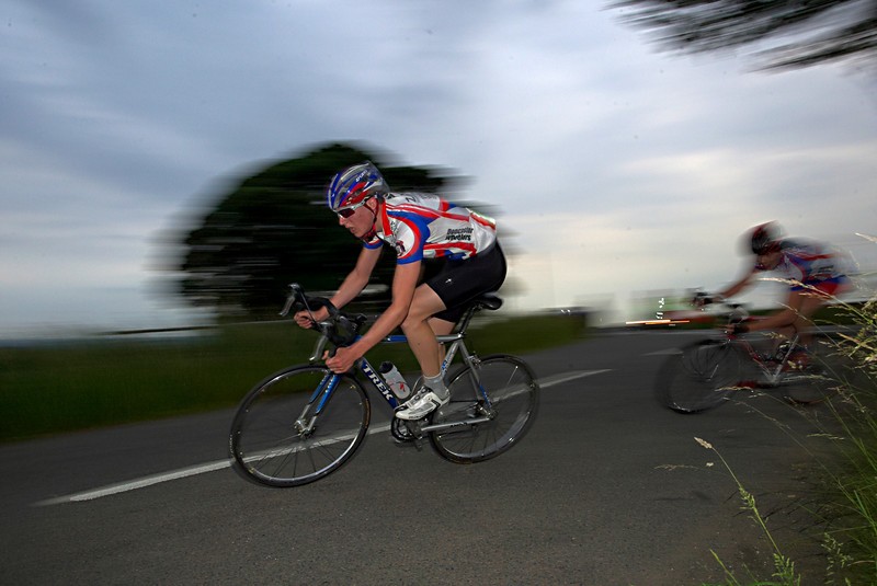
#2 is the best of the bunch, but I don't like that his tire is cut off, and there's not much energy in the photo. The framing isn't great on any of these. The dynamic range of the image is too great, and the area that is supposed to be the 'location' (the bike park) is way too dark. Also, what's with all the people in the shot. They compete big time for my eye. If they don't serve the photo, get them out of it. Shots like this can work if everyone in the crowd has their eyes glued on the main event (the biker). That way if you look at them, their eyes direction leads you back to the biker. But nothing about the shot makes me want to look at the biker. When I look at this shot, I spend about 1/4 of a second looking at the biker, then I want to see what all over that colorful pillar, there's a guy in a red scarf, I want to see what he's doing, oh he's got a camera, then the leading line of the railing by him takes me deeper into the photo where I see two people walking back towards a car, which sort of brings me visually near the front tire of the bike, which sort of bring me back to it.






![[No title]](/data/xfmg/thumbnail/40/40306-ea393f71adcd88a9abb9fb16dc6af2d5.jpg?1734174714)
![[No title]](/data/xfmg/thumbnail/40/40288-4d5d7a8aa74ddfceb5fb82062d9b21be.jpg?1734174702)
![[No title]](/data/xfmg/thumbnail/40/40302-79b0636c0b67a1ed65f8ad9e01c690e7.jpg?1734174711)