Bosnia in my Heart

baja2013

TPF Noob!
Joined
Feb 3, 2013
Messages
33
Reaction score
3
Location
Sarajevo
Website
bajazid.blogspot.com
Can others edit my Photos
Photos NOT OK to edit
This thread is about my pictures from Bosnia and arround. Hope you will enjoy it. Any critic is welcome!
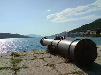
First one is about the summer and nice weather, small town on the Adriatic coast...
$neum.jpg

More info about it read on my blog:
Visit Bosnia with Baja: Neum

Thanks for reading!
 
In the first photo, I don't the point of adding the foreground and the cannon, when there is a blue bottle cap lying there. You simply could have picked it off. Personally I would have took a separate photograph for the cannon (without the bottle cap) and a separate one for the landscape. I don't mind the cannon, but it just looks plain awkward. Maybe you shot it at a bad angle. Not a bad photo anyways.

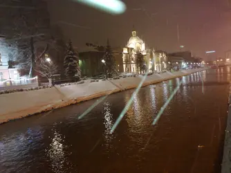
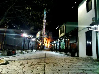
Second photo, the winter one: You tilted the camera, and the snow looks like as if you took it inside a car a car and these were some scratches or reflections on the window. If you wanted long trails, you should have checked the situation. It was windy and it doesn't look good. Also the building on the far left is overexposed and looks like a negative. I would have simply cropped it off by zooming in a little, that would have also cropped the remains of street on the right. Though you captured the water and the snowy trees successfully which is an area photographers struggle at.

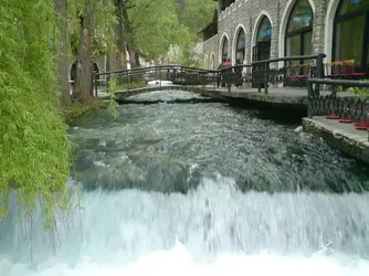
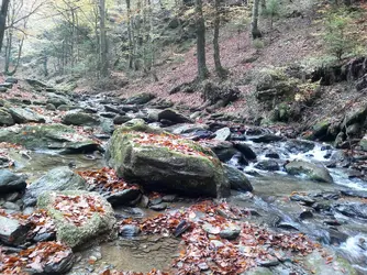
Third photo of water: Water in motion is a difficult subject to capture. Fast shutter speed makes it seem as it is frozen and shows no motion at all, while a too long exposure makes foamy streams which is so unrealistic and spoils many shots of water (There are some exceptions though). You used a very good shutter speed for the water. The presence of other people ruins it, and mends it at the same time. Good photo anyways!

Egg town:

1) I WANT MOAR!!! Such a good photo. The water, wood and green is providing a very good contrast.
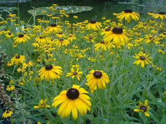
2) You should have used a more shallow DoF. The subject is getting into the background, it isn't isolated that much.
3) Quite a good photo, Take one more shot by holding the camera a little lower, but perfectly leveled.

EDIT: Also please try to number your photos, it makes it much more easy when giving Critique.
 
Thanks very much for you remarks.
Bootle cap is an internal joke, next time I go there everything will be done according to your inputs.
The snow stripes are due to flash, every "scratch" is snowflake :)
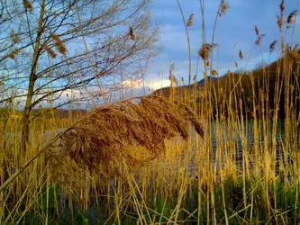
Sedge has that background due to sun light which was behind me, golden color atracted me.

This is the kind of feedback I like the most. Thanks again!
 
Last edited:
Thanks very much for you remarks.
Bootle cap is an internal joke, next time I go there everything will be done according to your inputs.
The snow stripes are due to flash, every "scratch" is snowflake :)
Sedge has that background due to sun light which was behind me, golden color atracted me.

This is the kind of feedback I like the most. Thanks again!

The snow stripes, try with a fast shutter speed to capture snow-flakes, what I meant was that (relatively) slow shutter speed (in windy weather) caused those randomly movement made it look like scratches. It would be okay if it was going straight from up to down. Plus do you see that white shiny spot right at the top, I'm sorry but that looks a little bad.

And for the sedge, what I meant was that the plants in the background and the subject, both are almost same colored and same specie. So it is hard to isolate the subject from the other plants, especially from the bottom of the flower, or that 'brush'.

I'm glad you like my Critique, I personally also like comments which make you think something, and learn something, even if they're harsh or wrong. I don't like facebook and flickr comments like Nice photos, great work etc!
 
I'm sorry, no offence, but your image quality at full size kinda sucks. Which camera you use?

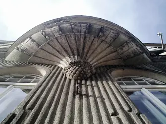
Black and white looks good, Also the angle is very good. When capturing strong lines that extend across a photo, the lines should lead the viewer's eyes into the picture, not lead it out of the picture. You've done it right.
 

Most reactions

Back
Top