I'm going to shamelessly bump this thread with the B&W version of this image. Hopefully this can get me some feedback. If these suck, I want to know why... so please start shooting!
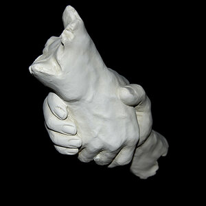
I like the edit. I think it works much better without the hand because without it the image seems more complete. With just the half hand it felt a bit incomplete, if that makes sense.
yes, the edit's good. it feels weird though cause i know what's supposed to be there. but if i'd seen this one first and then been shown the one with the hand i would say this one is better. agreed with the above comment about the trumpet. dodge that horn!
I like the edit. I think it works much better without the hand because without it the image seems more complete. With just the half hand it felt a bit incomplete, if that makes sense.
This gave me a good chuckle and I appreciate you for that! I don't do sky management, I'm just a guy with a camera (not a photographer) (Welcome to the forum, btw)
OK no one's mentioned this, but the framing is awkward. You show 3/4 of the angel. If you can reshoot it, try shooting the whole angel and a bit of the base it is mounted on. It's like shooting a person from the knees up. Awkward.


")
![[No title]](/data/xfmg/thumbnail/37/37607-69784b19e25bd0ba68e92ff4cfdfa8ff.jpg?1619738148)