Bre C&C welcome!

foned

TPF Noob!
Joined
Aug 3, 2004
Messages
226
Reaction score
0
Location
Sacramento, CA
Website
www.flickr.com
Can others edit my Photos
Photos OK to edit
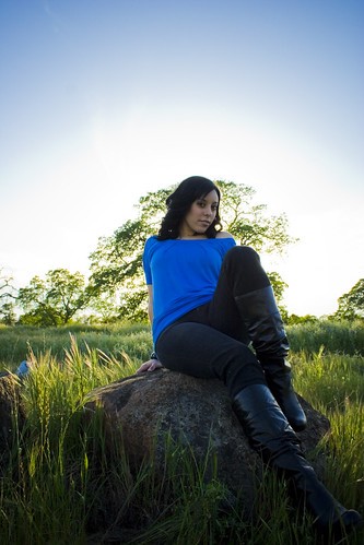
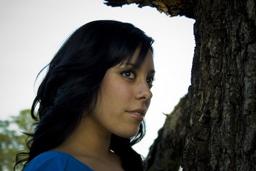
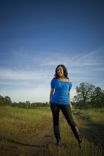
well, my latest shoot, hot off the presses. Tryin to use all the great advice you have all given, let me know how im doin ;]

3419705277_98aa71ea0f.jpg

IMG_2975 on Flickr - Photo Sharing!


3420510348_28a6ec4746.jpg

IMG_2966 on Flickr - Photo Sharing!


3420507618_b018063178.jpg

IMG_2988 on Flickr - Photo Sharing!


3419700265_2a3f34a5e6.jpg

IMG_2945 on Flickr - Photo Sharing!


Thanks!
 
Pretty decent set here! I like the first but I wish her head was above the tree in the background. And there is something in the back on the left you could probably clone out.

The lighting on 2 looks great, probably my favorite, but I want to see more of her hair in the frame, not so much of the tree branch in front of it. The detail and lighting on the little bit that is showing looks great though. I'd even push the DOF a little more shallow to get rid of that tree detail behind her.

The 3rd is a little flat for me. Composition looks like the tree is eating her head.

The 4th is nice, but I might push it a touch lighter. You have a spot on the upper left portion of that photo too you could clone out.

Again, nice set though. Your work here is always pretty good.


Thank you for the input, i appreciate it!


#1 the thing behind her head is a curl i believe, that one got away i guess she hadn't fixed it before this picture, i'll have to PS that.

#2 thank you, i think your right about the DOF, this is one of my favorites of the set.

#3 there is something i like a lot about this photo, but i agree there is a lot wrong with it.

#4 wow, thanks for pointing out that spot i don't think i ever would have seen it, nice catch.
 
#1 the thing behind her head is a curl i believe, that one got away i guess she hadn't fixed it before this picture, i'll have to PS that.

Maybe I'm wrong, but I think he meant the thing in the grass on the left side.

Wish I could make a set like this... keep it up! :)
 
ha. now i see that that's the rock. I couldn't figure it out--thought it was litter. sorry. :blushing:
 
I don't like her pose in the first one, I think it's unflattering. Unless you're 110 pounds and have legs like Tina Turner, it usually doesn't work. Maybe it's me, but her legs look huge compared to her upper body. However, I love the halo of the sun behind the tree, and had she have been in a different position it would be a great shot. I like the last one best.
 
I really like the first and last one. What lense did you use?
 
I don't like her pose in the first one, I think it's unflattering. Unless you're 110 pounds and have legs like Tina Turner, it usually doesn't work. Maybe it's me, but her legs look huge compared to her upper body. However, I love the halo of the sun behind the tree, and had she have been in a different position it would be a great shot. I like the last one best.

I disagree, but thank you!
 
I remember telling you to crop closer to the model in portrait scenarios and there is definitely great improvement in these shots. Keep it up.

One last thing, its not perfect yet, I still see alot of dead space that you can do without, but definitely a great improvement.
 
I remember telling you to crop closer to the model in portrait scenarios and there is definitely great improvement in these shots. Keep it up.

One last thing, its not perfect yet, I still see alot of dead space that you can do without, but definitely a great improvement.


Thank you very much, I guess its just sort of something I like, i enjoy the surroundings being involved.
 
Thank you very much, I guess its just sort of something I like, i enjoy the surroundings being involved.

Agreed. Having interesting things in the background can make a picture. That doesnt mean we cant use all 360 degrees of time and space to tighten up the crop while still attaining these details :)

just like helping :)
 

Most reactions

New Topics

Back
Top