- Joined
- Oct 16, 2012
- Messages
- 14,632
- Reaction score
- 7,562
- Can others edit my Photos
- Photos OK to edit
Attachments
Last edited:
Follow along with the video below to see how to install our site as a web app on your home screen.

Note: This feature currently requires accessing the site using the built-in Safari browser.
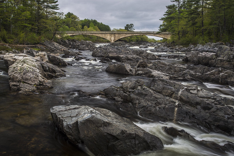
Nice, but I wish the bridge was closer. Either zoomed in a bit or you physically moving closer. The rocks are nice, and the water is nice, but there's no specific subject.
The fore runs into the middle. Looks all the same. Normally not a bad thing but since they stick up and it is rocks we are seeing way to many rocks through the first 2/3 of the frame. It becomes "busy". The bridge isn't in good enough or shot interestingly enough in detail to really bring it out. So this makes for a bland photo in some ways. The overcast in the sky and desaturated coloring adds to the bland effect. The shot is taken just from a point where it makes the chopped trees obvious. Closer would have avoided this, further back would have given you a tunnel effect. Right where you are isn't the place to be. The two main leading lines left water is stopped in the middle ground. The second the rocks running up the middle of the frame we discussed the rock problem above. The only real appeasing pattern in the frame is the arches of the bridge. Some kind of highlight, sky, more detail in the bridge, less rocks, anything to bring this up a couple levels in happy mood or interest would be a blessing.Nice, but I wish the bridge was closer. Either zoomed in a bit or you physically moving closer. The rocks are nice, and the water is nice, but there's no specific subject.
I was thinking the whole scene was the subject. Fore, middle and background.
Nice, but I wish the bridge was closer. Either zoomed in a bit or you physically moving closer. The rocks are nice, and the water is nice, but there's no specific subject.
I was thinking the whole scene was the subject. Fore, middle and background.
Hmm, we'll agree to disagree.
")
Hmm, we'll agree to disagree.
We can agree that disagreeing is disagreeable.


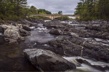
I took the crop the opposite way to keep the nifty water flow on the bottom right and to keep two spans of the bridge. One span just kinda loses my interest.I just edited my first post to give it a more critical and negative tone since you bumped it wanting more. I just cut half the pic and brought up the light and contrast. The trees in the top left seem to balance with the rock on the bottom right. Still don't like the chopped trees but about the best I thought of. your original is actually pretty good. Nothing is perfect. two cent I don't know noth'n..
View attachment 75102
I went for somewhat of a clear leading line and less rocks overwhelming the frame and tried to find some balance. Really, I don't like either one particularly not much to work with here. His original was pretty good.I took the crop the opposite way to keep the nifty water flow on the bottom right and to keep two spans of the bridge. One span just kinda loses my interest.I just edited my first post to give it a more critical and negative tone since you bumped it wanting more. I just cut half the pic and brought up the light and contrast. The trees in the top left seem to balance with the rock on the bottom right. Still don't like the chopped trees but about the best I thought of. your original is actually pretty good. Nothing is perfect. two cent I don't know noth'n..
View attachment 75102