

sleist
Been spending a lot of time on here!
- Joined
- Nov 8, 2009
- Messages
- 3,872
- Reaction score
- 2,368
- Location
- Somewhere in Florida
- Can others edit my Photos
- Photos NOT OK to edit
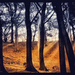
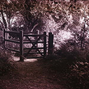
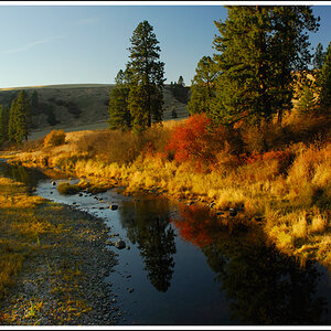
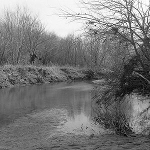
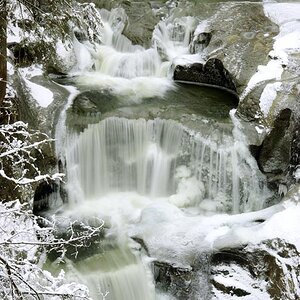
I know the processing is over the top for many, but I do like it despite some issues.
Feel free to tell me I suck.

Feel free to tell me I suck.
Last edited:


![[No title]](/data/xfmg/thumbnail/36/36395-66eaff4565ecf4245f13a9c469a9273b.jpg?1734168775)

![[No title]](/data/xfmg/thumbnail/36/36394-700ff78d7b45c663863e641a9bcf1fe1.jpg?1734168775)
![[No title]](/data/xfmg/thumbnail/40/40356-883c642c8d24d2709b359f9c8b196fcf.jpg?1734174788)

![[No title]](/data/xfmg/thumbnail/36/36396-f8e84def7352af726df923054b86284f.jpg?1734168779)