Hi,
This is my first post (woopie!).
It's interesting to see everyones comments and how you have progressed in your layout.
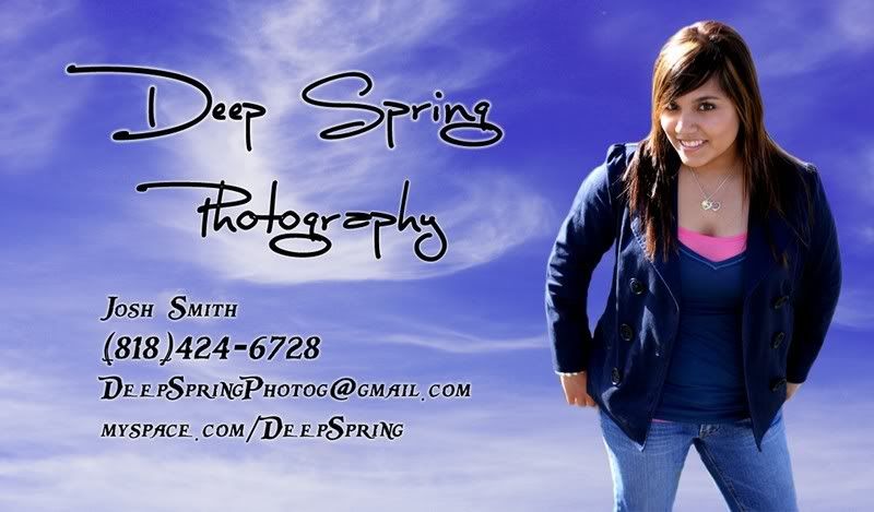
I think your latest layout is far-better then your first idea - but I think there is still one MAJOR thing letting it down - your chosen photo. Yes, it may be the "best girl" selected from the first layout - but (to me at least) it doesn't say "Hire me! I'm a fantastic photographer! I can turn you into a goddess or make you look interesting" - in stead it says "I can take a photo of someone from a high angle and make them look normal - in fact, this is a photo of my daughter that I took at our family BBQ".
You said in one of your posts that the reason why you put so many images on your business cards was to show prospective clients your "range of photos/styles". Ummm... all the photos are the same portraits of teenagers all with the same lighting and mood. How is this showing a range of your photographic talent??
If youre going to include a photo on your bus card it needs to be interesting, it needs to catch the viewers eye, it needs to make the person say ****, thats good! or how did he do that? or I want him to make me look like that! just as one of your other critiques says 90% of the people will throw away your card
. At the moment Im throwing away your card


![[No title]](/data/xfmg/thumbnail/36/36651-948fc64542c147745d3f3c48bce31dce.jpg?1734169165)


![[No title]](/data/xfmg/thumbnail/36/36650-edd8c21212fe9fbd7e59bfb08cdc91ea.jpg?1734169165)


