Business card layout ideas?

This is my card draft so far, though I may redo it (again).

It's going to be printed on linen paper. I wanted something simple and clean.

1067648395_593c101ac8_o.jpg


I agree with the above. Much as I love the butterfly photo (I took a similar photo that I have at the opening page of my personal website talulafairie.com), it doesn't work to showcase the work you're going to be doing for clients.
 
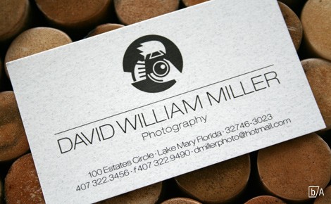
MillerBusinessCard.jpg


I think that card is very well designed simple yet effective.
i would have to agree that this card is amazing and very well done.

as for card finishes i tend to stay away from glossy just becuase it is hard for someone to write on and it leaves terrible finger prints. As a designer myself how ever i tend to like the look of glossy. I did find a great place to print my photos as well as other promotional materials both for myself and my clients. When possible i would recommend a simi gloss.
 
Little earthquakes... can I make a suggestion? If you capitalise each word in your website address it makes it easier to read. Google Ads told me that anyway. hehehe. :)

ie: www.littleearthquakesphotography.com
vs
www.LittleEarthquakesPhotography.com

hmm.. well I'm a little scared to post my business cards on here... because well... it's very different to what anyone's posted so far.

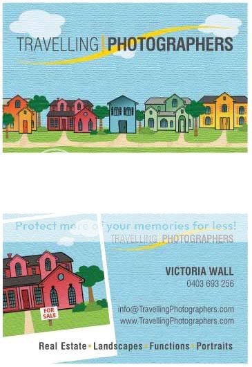
Here goes.... Can anyone guess that I do real estate photography? hehehe.

businesscard.jpg
 
hmm.. well I'm a little scared to post my business cards on here... because well... it's very different to what anyone's posted so far.

Meysha,

I like your card. It's interesting and eye catching. The images don't overpower the text either. The theme matches what you do.

Don't worry about other opinions. They are only opinions and are quite varied. No one's opinion here has proved to be right or wrong, including my own. :cool:
 
It's going to be printed on linen paper. I wanted something simple and clean.

1067648395_593c101ac8_o.jpg


Lindsay:

As much as I respect your desire for simple and clean, I think that you need to imagine a situation where a prospective client is given 20 business cards and has to select one person to be their photographer.

In this hypothetical situation, simple and clean probably isn't going to win out...

Every aspect of a business card should have one goal... to make the person holding it feel like they'd be an idiot NOT to hire you.

In your case, you need to have some element on your card that makes people want to click on your website. Just putting your link isn't going to do it.

Try some sort of call to action to get people to click on it, e.g.: "To save 25% on your first portrait, please visit my site today: www.xxx"

It's still fairly basic, but at least it gives people a reason to check out your site.
 
here's my card. I'm a graphics designer and I live with the philosophy that EVERY NEW client will judge you based on your business card, I get many compliments from it. This is a digital version (actual print is much better) of my card and it looks just like this, ROUNDED CORNERS, MATTE FRONT AND BACK and printed at www.overnightprints.com, from alot of searching I vouch for these guys , all my advertising prints go through them, the quality is SUPERB! make sure your card is unique it will give you an edge...

FRONT
bcfront.jpg


BACK
bcback.jpg
 
My business cards are printed GLOSSY and so many people comment about it that I'm not about to change it back, ever. :)

I also have postcard sized cards printed out with more photos on them, so I give out both to prospective clients. The business card is for information, and the photo postcard is more of a promotion of my work. :) I use VistaPrint.com for my printing needs.
 
Doesn't VistaPrint annoy you with the amount of spam they send you? Every single bloody day I get an email saying 75% off! or I love the one where they go "Ooops, we accidentally advertised it as 80% off... but we'll honour that until next Friday" Yeah bull... you did it on purpose.
 

Most reactions

New Topics

Back
Top