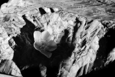
I think the image has lovely tonality, but if the subject is the buttercup, it needs to have had better lighting. Without it, unfortunately it is a bit of a jumble.
Not film, it's a Nikon D3100. I seem to have some savant ability to render digital like film, though, since I get this not infrequently. Interesting crop and rotation, hmm.
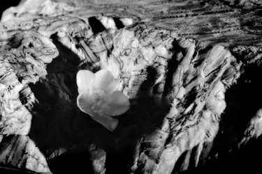
I have done some burn&dodge. I'm generally opposed to posting a new version, since people will always see if through the lens of the old version, and will tend to see the same problems even if they have been mitigated. With "fresh eyes" a new version looks quite a lot more different. All that said, here's a new version:
No, I agree this is improved. The buttercup is in shadow and there isn't much you can do about that, but it's definitely lighter overall, without losing the pretty tones and softness.
Are you fond of the deep shadow on the right side of the frame? I ask because if there were one more thing I might offer up, it would be to go with a square crop, so the subject is clearly the subject despite the shadow. It seems to be growing in this little wallow, which adds nice texture, but I don't think you'd lose anything critical if you squared it (unless, of course, you like those edges as they are). Is that anything you might consider?
hhhmmmm, I like this version. And I'd make the buttercup its bright yellow self against crisp black and white...if it were my photo and I knew how to use photo editing software like Photoshop. sigh.
I agree that jenko's is excellent. Personally, I cannot unsee the orientation that was actually present, so to me it will ever be askew. Which is too bad, because I think it is better.






![[No title]](/data/xfmg/thumbnail/31/31746-12607d714ca2713b95250821c881aea9.jpg?1734160460)
![[No title]](/data/xfmg/thumbnail/32/32782-7f10503454a2a8eeff8b554e3b081c86.jpg?1734162474)
![[No title]](/data/xfmg/thumbnail/41/41906-b9041eb5a3fa48eb5d5084ac2198a75c.jpg?1734176271)
![[No title]](/data/xfmg/thumbnail/37/37518-fb05b52482bd05e84fb73316ba1a9c8f.jpg?1734170679)
![[No title]](/data/xfmg/thumbnail/32/32983-e979bc0c64090f2693d7fae6b3cc425c.jpg?1734162936)