What's new

C&C (Again) Please

First things first - it would be quite helpful to reviewers, if you would number your images as you post them - this makes it a lot easier for a person commenting on them to refer to them. Thanks.

First impressions...FWIW -

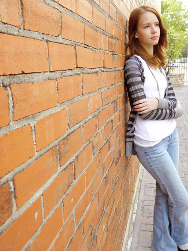
#1. Crop is too tight, you cropped off parts of her right knee and leg, as well as her left foot. Also, the skin colour of her face does not match the skin colour on her left hand - hand seems to be a bit lighter in colour than her face.

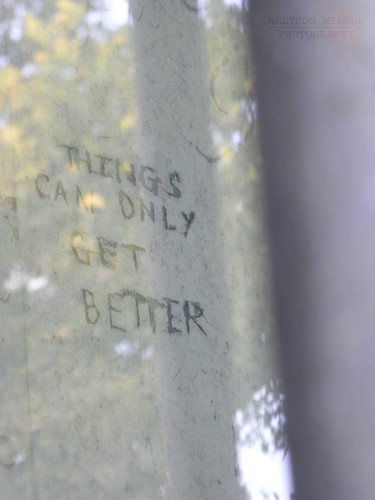
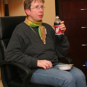
#2. Interesting - I guess it means something to someone - nice to remember. Curious to know how and where this image came about.

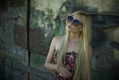
#3. Not bad, I like it, but that doesn't mean everyone else will. Only nit on this one is that the sky and the trees in the background are blown out. The wrinkles in the fabric of the sleeve of her top will also draw some criticism - a lot of folks do not like to have clothing that a model wears wrinkle the way this fabric does - personal choice, you either like it or you don't.

HTH.

Cheers,

WesternGuy

 
I like the color of #1, and agree with WesternGuy on the crop.

 
Now I disagree with the others here.

On number one I think you had the model in the wrong spot. I would have put her further to the left of the frame. Basically in the place where the brick is in focus on your current shot and made it a half body shot instead of trying to get a full body shot which you clipped her feet from.

Like this....

half body shot by DiskoJoe, on Flickr

#2 just looks like a snap shot.

#3 - now this is good. I like this. Framing is good. Try not to blow out the background though. Its distracting and you lose any type of helpful bokeh you may have gotten from the distant background.
 
Number one has potential but you were in the wrong spot. If you have come out and around just a bit to elmininate the trees etc you could have still had leading lines to her. Are you editting this, I think the contrast on number one could be bumped. Actually could be bumped on all of the. Number 2 is interesting but I think I would like to know the story behind it rather than look at the image. Just doesn't do a lot for me. I don't care for number three at all. Too many technical things going on, blown sky, awkward disconnected pose. Keep posting and sharing. It also helps when askin for critique if you let us know what you like and don't like about them.
 
Thanks everyone for the input. I think I still have an uncropped version of the first picture so I'm going to see if I can fix the crop on that one. As for the third, the background is blown out a bit too much because I was cloning out a building, but I can hopefully fix that as well :)
 

Create an account or login to comment

You must be a member in order to leave a comment

Create account

Create an account on our community. It's easy!

Log in

Already have an account? Log in here.

Back
Top Bottom