What's new

C&C? Approaching ferry

Compaq

Been spending a lot of time on here!
Joined
Aug 29, 2010
Messages
3,400
Reaction score
657
Location
Norway
Can others edit my Photos
Photos OK to edit
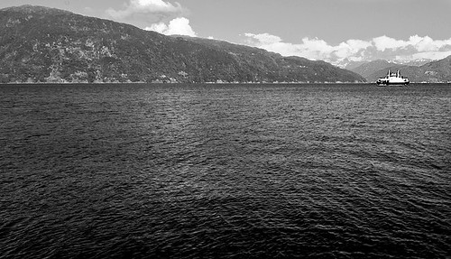
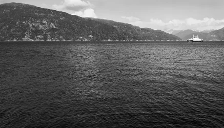
MS Kvinnherad came in while I was shere, so I took some shots of it approaching. Here's one I liked, even if there isn't much going on in the frame. Pretty much only one place to rest the eye: on the boat. It's a simple photo, but I like it, sort of. C&C appreciated.


Ferge_2 by Anders Myhre Brakestad, on Flickr


Anders
 
not going to criticize the composition, as that seems to be what you were going for. I like the leading lines of the mountains pointing at the boat. Good use of diagonals there to highlight a small subject.

I think the sky would be better if you burned it a bit, and then added some contrast to the overall image, which seems a little flat to me.
 
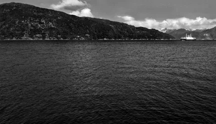
Here's what I thought as far as post went (though working from a JPEG, obviously not ideal):


7362933906_a9071eecf1_z by franklinrabon, on Flickr

Burnt the sky, added some overall contrast, and then dodged the front water (as with adding the contrast it got a bit too dark). Also sharpened the boat a tiny bit, though this didn't work out particularly well, given the source resolution.
 
Problem I had is the conversion was not very great. It is more gray than b&w. I tried to do some things, tried to give the clouds some shape and depth, tried to give the mountains in back some shape and depth...other things as well, but I don't think it came out too well. lol.


$7362933906_78079d8f44_o-1.webp
 
What did you use to do the conversion? You should have been able to adjust to create separation of elements. green should have altered the hills a bit, cyan and blue would have altered sky, water, and lights/whites, yellows the boat and more of the land....etc...etc...
 
All editing done in ACR. I've got some more of the ferry, but those are similarly lacking contrast.


Ferge_4 by Anders Myhre Brakestad, on Flickr
 
I kinda like that one. Feel like posting up the color version, maybe we can help with conversion. I'm not a pro by any means...but I have been playing alot with them lately.
 
I decided to do everything in ACR, but I really hated it. I can adjust separate colour channels, but I'm a big fan of using layer masks. Adjusting curves only in the sky etc etc. It was an attempt to save editing time, but feel like I need to go over them again. Here are all from the set. C&C on the conversion, please :)


You gotta love the wide angle distortion :)
1

Ferge_8 2 by Anders Myhre Brakestad, on Flickr

2

Ferge_7 2 by Anders Myhre Brakestad, on Flickr

3

Ferge_6 2 by Anders Myhre Brakestad, on Flickr

4

Ferge_5 2 by Anders Myhre Brakestad, on Flickr

5

Ferge_4 2 by Anders Myhre Brakestad, on Flickr

6

Ferge_3 2 by Anders Myhre Brakestad, on Flickr

7

Ferge_2 2 by Anders Myhre Brakestad, on Flickr
 
really liking two and three for their comp. pretty cool.

something is a miss in the conversion and I don't know how to put it into words. Maybe someone who knows more can say. Seems still kinda all the same though...kinda all gray...or shades of dark and light gray. not black and white with some gray. maybe a little less blue..more yellow? dunno without playing with it.
 
There's nothing wrong with greys. Any fools can get blacks and whites, that's just a question of sliding the sliders around, or picking a sufficiently high grade of paper if you're printing wet.

It's getting the middle tones right that's tough.

What appears to be going on here is that everything in play is quite small. The boat, the clouds, the details in the hills. These are all tiny features, and they're either not in focus, or the small aperture together with lots and lots of air is making them soft. Regardless, you have a very soft image here, with relatively sharp water in the foreground. Attempts to ratchet up the drama by making a bunch of randomly selected crap be black and another bunch of randomly selected crap be white is going to be a lose.

I would leave the greys alone or possibly add a little contrast to the higher midtones, but lightly, and burn lightly everywhere around the ferry to emphasize the that point, and then add drama to the ferry itself with some careful burning and dodging.

Basically this isn't going to be much of anything unless you can get some detail in the ferry, which isn't there. It's just a blob.

$ferry-new-small.webp
 

Create an account or login to comment

You must be a member in order to leave a comment

Create account

Create an account on our community. It's easy!

Log in

Already have an account? Log in here.

New Topics

Back
Top Bottom