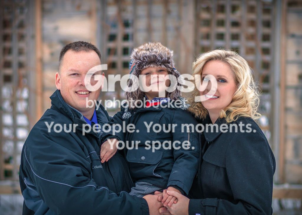
#1 money shot. Was that taken at the end of the session?
Thanks! It was actually taken in the middle. He was getting a bit impatient inside, so we went outside for a few minutes to break it up.
#1 is decent but way overexposed and too cold.
That kid has got to be handled so he doesn't make a monster grimace like in the indoor shots.
Thanks for the feedback, and the edit. I like the results. TBO, that is how I would usually have edited it, give or take a tad, but I thought I would try something different. I do like your edit, though!
Best of the lot! All look relaxed on this one, dad is obviously the best model 'cos he looks natural in all of them that he's in.[/QUOTE]
Thanks! Dad is definitely much more of a "go with it" kinda guy. Helps tremendously!
C&C per req:
1. Significantly over-eposed; Mom and Dad have little detail/texture left in their facial skin. Watch your cropping the longitudal cropping of their arms hurts the image as does the messy, bright and complicated background. I think with a bit more work in post you could have a nice family shot out of this one.
2. A little too close I think. Again your background choice is less than ideal; you have half busy, complicated Christmas, and half plain, white wall with a dividing line going right through Mom's head. Moving one way or the other would have helped a LOT as would shooting in portrait orientation. I would remove the disembodied hand!
3. This is cute, but needs leveling/distortion correction, and is significantly over-exposed (as a result your monochrome is very mid-tone rich and 'watery'). Again, choice of backgrounds reallllly hurts you here.
With some more work in post (assuming you shot RAW), you could pull a decent set out of this, but be very cogizant of your backgrounds; look for plain, non-distracting areas free of linear elements and distinctive geometric shapes. Ideally your background should be at least >1/3 stop darker than the subject's face. Also watch your exposures and ensure that you meter the scene correctly.
Just my $00.02 worth - your mileage may vary.
~John
Thanks a lot for your feedback, tired! Do I detect a running theme in your C&C about backgrounds? :mrgreen: I totally agree, the backgrounds are busy and uneven. It was really challenging because there house is pretty small, and there aren't many straight shots that gave me the distance I needed to frame the shots. She really wanted it "Christmasy" and there was only one place in the house that fit the bill, in front of the tree.. As a result, I was pretty limited. With that in mind, I think there were some small changes I could have made to minimize the effect. Do you have any suggestions for dealing with cramped spaces like that? Especially how to keep the background at a lower exposure when there isn't room to separate the subject very far from the background?
Here are a couple re-edits I did with your suggestions in mind. Thoughts?
1. Reduce the exposure and brought some of the detail back by clipping the highlights a bit more. I also recropped to remove the longitudal crop of their arms. I know it's still pretty highly exposed, but to be honest, I like this one that way. I also did a tad bit of vertical perspective correction to bring the leaning lattice work more upright.
There was also this one, in which I shot it a tad lower so the arms weren't cut off. I just wasn't a huge fan cause mom's eyes are half closed..
3. I did some perspective correction in bot horizontal and vertical (which I hadn't even though of and it made a HUGE difference, so thank you!) and reduced the exposure, brought the highlights down, and adjusted the color channels on the B&W, which I think helped bring some of the tonal range back.