What's new

C&C on shoot with a chick named amanda

Puma

TPF Noob!
Joined
Oct 24, 2007
Messages
131
Reaction score
1
Location
Bell, Fl
Can others edit my Photos
Photos OK to edit
.

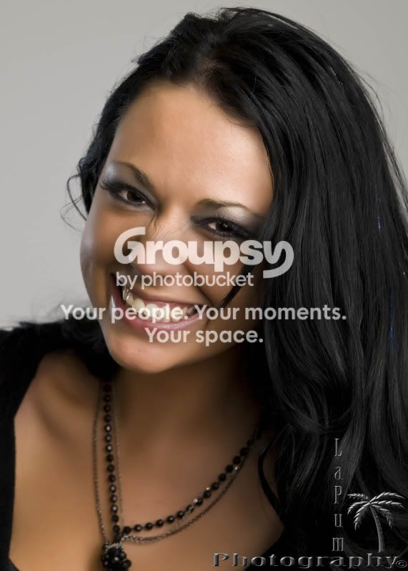
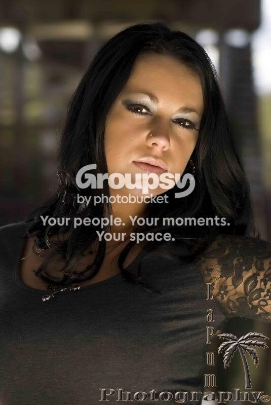
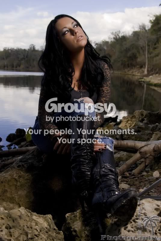
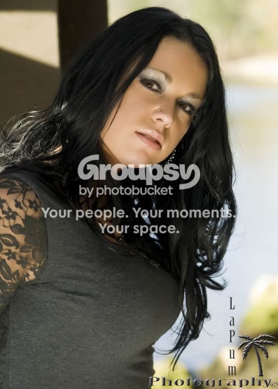
I been trying to get better and practice as much as I can between working and normal life. Last weekend I did a photoshoot with a chick named Amanda. I feel that they are my best shots so far. So, I'm looking foir C&C on what y'all think.

#!

DSC_00835x10cropsmoothed.jpg


#2
DSC_0084editcropsmall.jpg


#3
DSC_0122editcropsmall.jpg


#4
DSC_0078editsmall.jpg


#5
DSC_0054editsmall.jpg


#6
DSC_0014editcropsmall.jpg


#7
DSC_0009editsmall.jpg


#8
DSC_0009cropclosesmall.jpg


#9
2DSC_0124editsmall.jpg


#10
DSC_0193small.jpg


#11
DSC_0140editsmall.jpg


Please be as honest as you want... I have gotten some pretty honest and blunt feedback so far and I have tried to learn from all of it. I am nowhere near where I want to be and still consider myself a newbie to photography. I just dont have the time to practice as much as I would like.

Thanks in advance,
-Puma-

.
 
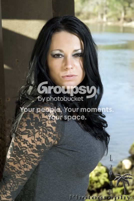
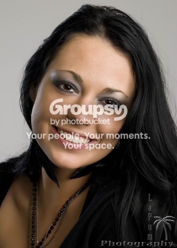
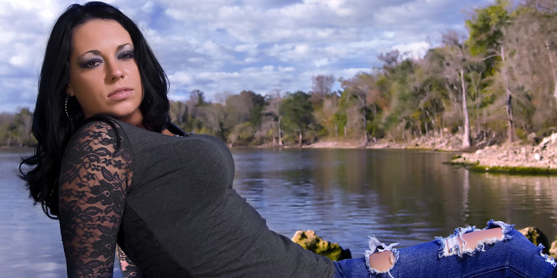
I really dislike the backgrounds on the first two. They seem fake and she doesn't match the environment. I like the ones that focus on her smile, 3,9,10 and 11. I would ditch the backgrounds.
 
.

The first 2 backgrounds are real... it was down by the suwannee river. Do they look bad? or did you just think they were cheesy fake backdrops?

-Puma-

.
 
.

Thanks for the compliment on 3,9,10 &11

-Puma-

.
 
I like 3, 6 and 9. In the rest, either the posing is a bit forced or the expression seems a bit forced.

I would say lighting is fine for just about all of them except 7 and 8. On 11, seems a bit soft to me.

My favorite of the set would probably have to be 9.
 
.

yes 7 & 8 are my least favorite also....i might cut them from the set. Thanks for the c&c... Im a new photographer and she never posed for photos before...it was tough getting her to smile...I had to tell alot of jokes. She said she wants to be a model but cant smile on command...lol

-Puma-

.
 
Uhm, she is certainly attractive but the first few shots her face is upstaged by large protrusions on her chest....lol, just a little too much distraction :D

#5 I like, just wish her head wasn't tilted up so much and there was just a bit more light but I like the frame and pose otherwise.
 
I thought they were shopped in. Something about it appears fake in my opinion. I don't know much about the technical aspect of why. Im new to this too perhaps she is too close. Keep it up. Can't go wrong with trying!!!
 
Very good shots. Minor little tid-bits keep them from being "Great" in my mind.

#1, #2 - I agree with others about the background. It either needs to be sharper or have more bokeh. As it is right now it's at the distracting point. Also, there's a strand of hair on her shoulder that look out of place.

#3 - Excellent light. That strand of hair on her left cheek and the loose pieces of hair by her right ear bother me.

#4 - Love the lighting! Great shot.

#5 - A bit on the dark side.

#6 - Shadow of a strand of hair. Sorry about all the hair comments but once I started noticing them I couldn't stop.

#7 - Yeah, shadow of a strand of hair. Also some hot spots on the left side of her face. That level of background bokeh would have helped #1 & #2

#8 - See #7. I love the light on the right side of her face though.

#9 - Just a tad of a strand of hair on her left cheek. Also the choker or collar around her neck looks odd. It would look better if it were completely closed or gone. Just a touch of a hot spot on her right cheek, otherwise excellent light and exposure.

#10 - Her hair blends into the background completely. A light, or even just a reflector, behind her to highlight her hair would have helped.

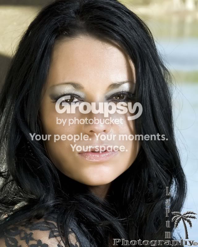
#11 - Her hair catches the corner of her left eye. Eyes are windows to the soul. Always make sure they are perfect.

Piddly little comments on a very good series.
 
Very good shots. Minor little tid-bits keep them from being "Great" in my mind.

#1, #2 - I agree with others about the background. It either needs to be sharper or have more bokeh. As it is right now it's at the distracting point. Also, there's a strand of hair on her shoulder that look out of place.

#3 - Excellent light. That strand of hair on her left cheek and the loose pieces of hair by her right ear bother me.

#4 - Love the lighting! Great shot.

#5 - A bit on the dark side.

#6 - Shadow of a strand of hair. Sorry about all the hair comments but once I started noticing them I couldn't stop.

#7 - Yeah, shadow of a strand of hair. Also some hot spots on the left side of her face. That level of background bokeh would have helped #1 & #2

#8 - See #7. I love the light on the right side of her face though.

#9 - Just a tad of a strand of hair on her left cheek. Also the choker or collar around her neck looks odd. It would look better if it were completely closed or gone. Just a touch of a hot spot on her right cheek, otherwise excellent light and exposure.

#10 - Her hair blends into the background completely. A light, or even just a reflector, behind her to highlight her hair would have helped.

#11 - Her hair catches the corner of her left eye. Eyes are windows to the soul. Always make sure they are perfect.

Piddly little comments on a very good series.

Wow thanks for the very detailed c&c ...thanks alot...I will go over the set and see if I can fix as much as I possible can that you pointed out. I tried to take out the stray hairs on some of them...I must of missed a bunch also...I will work on it.

On #9 its actually some feather earrings that came in around her neck on that photo...but I see what you mean.

I actually see what you mean on all your comments and truly appreciate the time spent on writing them down for me...and thanks for the compliments...made me feel good. I will try and get some more practice in and hopefully get better. This is actually the first shoot where I feel really good about some of the results. I still have a long wsay to go.

-Puma-

.
 
I like 10 the best she looks natural there and I have to agree with the OP on little light in the background, overall nice set photos.
 
Way too many to C+C on. I like #9 the best though. The exposures need some work on a few and the white balance in the first few is what is causing the background to seem fake I think. Here is a quick edit of the first one to color only.


Edited copy by GooniesNeverSayDie11, on Flickr
 
Boxhousev said:
I really dislike the backgrounds on the first two. They seem fake and she doesn't match the environment. I like the ones that focus on her smile, 3,9,10 and 11. I would ditch the backgrounds.

This. Well I dpnt mind the backgrounds but the ones where she is smiling are the best
 
Shes hot but her look and lakeside dont mix well. This is an urban girl here. Take her in the city and snap some pics. AS far as exposures, these are pretty good. Maybe pan out and get some full shots of her to mix in with the variety of close ups. I would definitely tell you to do another shoot with her.
 

Create an account or login to comment

You must be a member in order to leave a comment

Create account

Create an account on our community. It's easy!

Log in

Already have an account? Log in here.

Back
Top Bottom