What's new

C&C on shoot with a chick named amanda

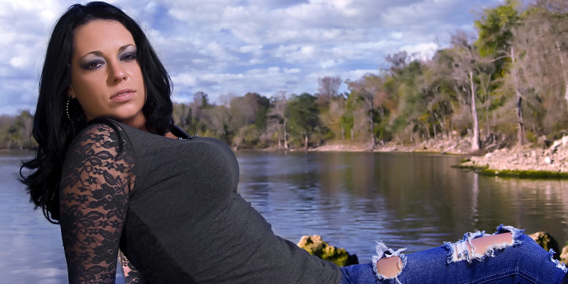
Way too many to C+C on. I like #9 the best though. The exposures need some work on a few and the white balance in the first few is what is causing the background to seem fake I think. Here is a quick edit of the first one to color only.


Edited copy by GooniesNeverSayDie11, on Flickr


I don't like this edit or the photo. The edit makes the colors way oversaturated for ME, and the background looks completely fake. I understand it's real (the background that is, other aspects of the photo are likely NOT real :lmao:), but it looks like the model was pasted on a backdrop.
 
By the way, it's usually better to get specific critique, if you only post one or two images at a time. With so many image, especially ones that are so different, it's hard to concentrate on specific things.

I too found that the ones in front of the lake, don't look so good. I think it's because of a bad balance between the ambient and what I assume is flash. Not only is the balance off, but the color temp doesn't seem to match.

And like some of the previous comments, I found the ones where she's smiling, to be by far my favorites of the bunch. And that just goes to show you, that after all the lighting, exposure, processing issues...we still need a good model and a good expression to pull off a good photo.
 
Those have got to be fake, and no i'm not talking about the pictures
 
.

Im not sure if they are fake or not actually...but they were nice. She is a friend of mine so I will ask her next time I see her.

It was hard ...extremely hard to get her to smile and when she did ..it was only for a second or two...I tried the counting to 3 thing..but she has some kind of weird tick where she would look away after each number was said...then she would look forward and smile for just a second...it was tough...lol

I will work on improving on my backgrounds...I actually achieved what I was looking for..but I guess I shouldnt of been trying to do that with the river background.

I think the different light comment is probably right on....I was using a sb-800 with a small umbrella and a reflector on the other side of her for light.


Thanks again for all the great comments and advice..I really appreciate both.

-Puma-

.
 
Way too many to C+C on. I like #9 the best though. The exposures need some work on a few and the white balance in the first few is what is causing the background to seem fake I think. Here is a quick edit of the first one to color only.


Edited copy by GooniesNeverSayDie11, on Flickr


I don't like this edit or the photo. The edit makes the colors way oversaturated for ME, and the background looks completely fake. I understand it's real (the background that is, other aspects of the photo are likely NOT real :lmao:), but it looks like the model was pasted on a backdrop.
Yeah, it was a quick edit on a low res image. It makes the point and looks a hell of a lot better than the original posted. The blues did saturate a bit much though. I realized that after uploading to flickr, but wasn't going to go nuts on it.
 
Personal, non-professional opinions here:

#1-she looks bored, neck is turned a little too much, would have liked to see her eyes opened more and yeah, the background doesn't really go with her style of posing or clothes

#2-Again, head turned too much, shoulder too high, or something, it looks like she has no neck but an awesome bod. But what I see is head, then body, but no neck, no flowing lines. And she looks bored. Being so hot, I bet she could do a little fierce and pull it off well.

#3-I really love this...now I see personality coming out. Skin is a tad soft for *my* tastes but it's not bad at all.

#4-I like it, but my eye is drawn to the lower right corner at times although I can't figure out why.

#5-The background is gorgeous...for someone else. Overall I like this although I would like to see a different expression on her face perhaps, maybe eyes slightly towards the camera a bit more so we actually see eyes and not just white

#6-Can't say anything really bad about this. The lighting looks good to me.

#7-I see a concrete beam growing out of her head. It seems a bit odd to have half of her in one part and half of her in a different part. My eye goes to the sun beam in the upper left by her head. The strand of hair and the shadow it's making it makes this an "OK" picture for me, but I strangely still like it.

#8-Without the strand of hair and maybe slightly softer lighting I would adore this.

#9-Very very nice. I don't like how her neck appears to be choked by something (earrings? hair?) and it leaves me in question but aside from that, GORGEOUS. Lighting seems perfect for my tastes.

#10-Would have liked to see her eyes a bit more opened here, and there seems like a lot of dead space in the upper left

#11-Seems a bit dull to me light-wise. Would have liked more light on her face, and her looking at the camera or perhaps up a little bit or something. I don't know, something seems off but it could just be the lighting and the chopped off side-of-arm.

Even despite the negative comments I still would love to have these pictures if I were here. Great job and keep on learning...you are well on your way!

 
Personal, non-professional opinions here:

#1-she looks bored, neck is turned a little too much, would have liked to see her eyes opened more and yeah, the background doesn't really go with her style of posing or clothes

#2-Again, head turned too much, shoulder too high, or something, it looks like she has no neck but an awesome bod. But what I see is head, then body, but no neck, no flowing lines. And she looks bored. Being so hot, I bet she could do a little fierce and pull it off well.

#3-I really love this...now I see personality coming out. Skin is a tad soft for *my* tastes but it's not bad at all.

#4-I like it, but my eye is drawn to the lower right corner at times although I can't figure out why.

#5-The background is gorgeous...for someone else. Overall I like this although I would like to see a different expression on her face perhaps, maybe eyes slightly towards the camera a bit more so we actually see eyes and not just white

#6-Can't say anything really bad about this. The lighting looks good to me.

#7-I see a concrete beam growing out of her head. It seems a bit odd to have half of her in one part and half of her in a different part. My eye goes to the sun beam in the upper left by her head. The strand of hair and the shadow it's making it makes this an "OK" picture for me, but I strangely still like it.

#8-Without the strand of hair and maybe slightly softer lighting I would adore this.

#9-Very very nice. I don't like how her neck appears to be choked by something (earrings? hair?) and it leaves me in question but aside from that, GORGEOUS. Lighting seems perfect for my tastes.

#10-Would have liked to see her eyes a bit more opened here, and there seems like a lot of dead space in the upper left

#11-Seems a bit dull to me light-wise. Would have liked more light on her face, and her looking at the camera or perhaps up a little bit or something. I don't know, something seems off but it could just be the lighting and the chopped off side-of-arm.

Even despite the negative comments I still would love to have these pictures if I were here. Great job and keep on learning...you are well on your way!

.

thanks a ton for going through each one like that.. i really appreciate your cooments and your honesty...it makes your compliments even more valuable...thanks

-Puma-

.
 
You're welcome!

Ya know, people, sometimes girls do have you know what naturally...like me LOL and I want to downsize! :D
 
i would say to practice most importantly on directing the model. you'll have to know and be as objective as possible to see what looks good on camera. it's a hard thing to accomplish, but if you keep at it, you'll begin to notice more and more things you hadn't before.

as what was already said, i don't think her clothing is most fitting for the nature scenes. i found number 3 to be the most natural looking. at least your lighting is good, so keep at it.
 
.

Yes directing the model is the biggest problem I have... I have never worked with anyone who has ever done ANY modeling at all...lol .... So, I keep getting women that are first timers and have no idea how to pose at all...I bring a bunch of papers with thumbnails of photos I like and try to get the "models" to look at them to get an idea of what we are trying to achieve.

My lighting has been very bad up until this shoot...I feel that I am starting to get the hang of it.... I have also started shooting using a gray card to help me with my white balance.

I feel pretty good after the comments on here and look forward to my next shot at making some photos.

Thanks,
-Puma-

.
 
The main reason the back ground looks fake on some is because she is the only thing in the foreground. You can't see the close shore line or any land or branches or anything. In number 5 you can and it looks much better. Other than those two, I think they're pretty nice. She has a great smile.
 
I really like the pics of her smiling. She's too pretty not to smile but i understand if you want different expressions. Good job
 

Create an account or login to comment

You must be a member in order to leave a comment

Create account

Create an account on our community. It's easy!

Log in

Already have an account? Log in here.

Back
Top Bottom