What's new

C&C please

ld3davis

TPF Noob!
Joined
Dec 4, 2011
Messages
35
Reaction score
1
Location
USA
Can others edit my Photos
Photos OK to edit
Hello all, I'm new to the forum and photography. I've been reading for a few months and just started taking shots. I'm not familiar with photo editing software at this time and concentrating on learning the camera and getting good exposures and compositions. Please let me know what you all think about these photos I shot earlier while out with the family. Unfortunately, I'm nothing more than a sponge for info at this time but I will do my best to "speak the language."

1.
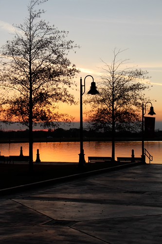

Sunset by ld3davis, on Flickr


2.
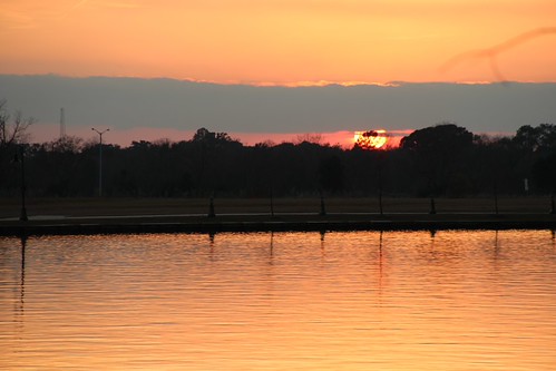
Sunset 2 by ld3davis, on Flickr
 
Last edited:
I'll be the one to say it, you'll get only/more critiques if you post the photos directly. People dont usually click the links.
 
Thanks a bunch. I read that in an earlier posts and trying to repost now.
 
I like the first one. Only thing to me is the tree on the left side is out of frame, and the horizon is tilting slightly upward to the right in both photos.
 
I love the first one. Thanks for the comment. I took about 100 photos this evening and it's apparent I own a crooked camera, lol jk. It was especially noticeable when i had stairs in the picture. I learned today that I need to pay more attention to and build muscle memory for holding the cameral level.
 
Lol! The joys of being a beginner!!! You take 1000 photos and come out with maybe 2 good photos!!
 
Last edited:
First, welcome to the forum. My first impressions:

#1. I like this one, the silhouette aspect particularly. My only concern is that you have cropped the tree on the left and this leaves the image a bit incomplete. Also the horizon appears to have a bit of a tilt to the right and is almost in the centre of the image. Check out the "rule of thirds".

#2. I like this one also, but I would try and clone out the jet contrail on the right side of the sky, and the lamp standard and the tower on the left. It would look better if there was a bit more detail in the shoreline area. This image would have been better with a graduated neutral density filter, maybe a 2 stop one. If you are going to get involved in landscape photography, you may want to acquire these at some point (my opinion).
Using Graduated Neutral Density Filters (this URL is one of many to be found on the web)

I think that you might benefit from doing some reading on compostion and I would encourage you to surf the web, but you could start with - Advanced Composition -- Part I - there are two following web sites with the links at the end of the site. As well, have a look at this one - PhotographyComposition Articles Library as there are a number of links to sites on composition. There are a number of books that have been written on composition - you might want to look at one by Bryan Peterson called Learning to See Creatively - Amazon.com: Learning to See Creatively: Design, Color& Composition in Photography (Updated Edition) (9780817441814): BryanPeterson: Books. There are lots of others. HTH.

Cheers,

WesternGuy
 
#1 is more interesting, and I agree with the previous poster about the tree on the left (cropping the top and the left side), but I also feel that if you are going to do a silhouette, there should be less detail and/or less of the frame should be dark. As it is, I'm looking at the foreground for detail which is really not there, but if you darkened it, you would have a large flat dark area. The best choice here would have been to frame higher so the benches/stairs were at the bottom of the frame and you captured the top of the tree on the left.
 
I really like your 1st picture better then the 2nd one. As others have already mentioned, you need to watch your compositions a little more, as you cut off the tree on the left, and the horizon is tilted downward to the left. That's very easy to correct with the editing program that came with your camera. You also managed to include just enough detail in the foreground to have some visual interest, since it dominates a large portion of the picture. For an unedited picture, your exposure choices were dead on.

The 2nd picture suffers from the usual deadly sin of dividing it in half, instead of using the in 3rds principle. In this case more of the foreground and less of the sky would have made for a much stronger graphic presentation.
 
Some foreground lighting would help give #1 a stronger sense of depth, and sunset shots almost always benefit from using a GND filter (Graduated Neutral Density), or making 2 exposures, 1 for the sky and 1 for the foreground to be blend post process. I don't mind part of the tree being cut off. The light in the scenen is way more important.

6509295193_370437b619_b.jpg
 
Last edited:
I really appreciate these comments. I am now more excited about getting out there and snapping more shots and applying all of your suggestions. I'm researching filters also.
 

Create an account or login to comment

You must be a member in order to leave a comment

Create account

Create an account on our community. It's easy!

Log in

Already have an account? Log in here.

New Topics

Back
Top Bottom