C&C these portraits?

zulu42

TPF Supporters
Supporting Member
Joined
Jul 18, 2015
Messages
4,148
Reaction score
5,993
Location
NV
Can others edit my Photos
Photos OK to edit
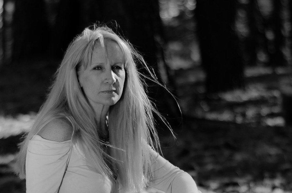
A friend liked a few of my photos and asked if I would do a portrait for her. She insisted that she would not be smiling, and much prefers B&W.

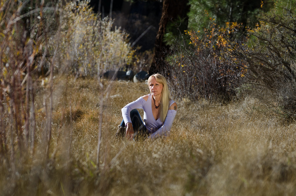
Seeking critique on all aspects, especially lighting, posing and processing.

Thanks for looking.

1.
Terry3 by Zac Ludwig, on Flickr

2.
Terry5 by Zac Ludwig, on Flickr

3.
Terry10 by Zac Ludwig, on Flickr

4.
Terry11 by Zac Ludwig, on Flickr

5.
Terry16 by Zac Ludwig, on Flickr
 
2 is my favorite here though I think you need to lift the blacks a little in that one and the 3rd too. I think the posing in the 1st looks off. Possibly a little bit of fill flash would have worked well here.
 
The second one and the third one works very well. Light is great, posing works, seems natural too me.
I'm not a big fan of the others. The first could have work if the neck wasn't looking that way, seems unnatural
 
2 is my favorite here though I think you need to lift the blacks a little in that one and the 3rd too. I think the posing in the 1st looks off. Possibly a little bit of fill flash would have worked well here.
Thanks for the comments. Today I'm seeing these on a different monitor and absolutely agree I need to lift the blacks a bit. Only supplemental lighting I'm using right now is a reflector, and learning that it is a challenge to get just right. Thanks!


The second one and the third one works very well. Light is great, posing works, seems natural too me.
I'm not a big fan of the others. The first could have work if the neck wasn't looking that way, seems unnatural

Thank you, I appreciate that. You're right about her pose on the first one. I think we got her hair to look great at the expense of her neck looking unnatural.

Overall this was a good learning experience. Terry is quite happy with several images in the set. I think most people would never guess her age looking at these photos.

Thanks for commenting :)
 
I agree with those above, but this is a great start. :)
 
I think 3 work best for me.
#1, her neck and torso are merged into an burly mass, not showing her lovely jawline.
#2 emphasized wrinkles in her neck and chest and, altho strong, not as attractive as she is.
#3 the best, imo, but a bit small in the frame

terri-3.jpg


#4 her arm is brighter than her face (which is a bit flat with dark eye sockets)
you've lost the woodsy look yet there is lots of empty space.

number-3-sepia.jpg


#5
Not as attractive as she is, IMO.
body all bunched up and far away.
 
I agree with those above, but this is a great start. :)

Thanks!

The_Traveler, thanks for the comments and especially for taking the time to edit a bit.
#3 is also my favorite, and I like your crop very much.

#4 Like your crop also, but I think I just don't have the resolution in that (already cropped) image to crop it again that tight.

Much appreciated, all replies, for helping me out.
 
If your regular monitor is a bit sub-par, it might be helpful to open each image in Photoshop or another editing program and manually check the black point, in the levels adjustment menu, to make sure that the black point is not too low. Shoot for something maybe in the 11 to 18 range, to ensure that the blacks are not super-dense.
 

Most reactions

Back
Top