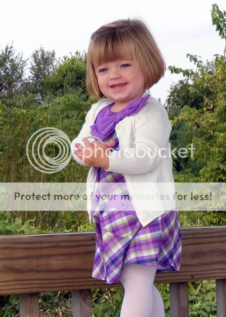
1) Focus is soft, and her legs are chopped off. Limb chop is a pretty common mistake, just try to get as much of your subject as possible in the frame.
Compositionally, she is dead center in all of these which doesn't make for a very pleasing composition. Google "the rule of thirds" for a good reference to help future compositions.
Good job not blowing out her white sweater in this, but the tones and lighting are very dull. I also see some magenta in her skin.
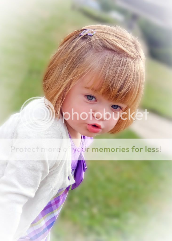
2) The lighting is less flat in this, which is good..but the focus is still soft. I'm not seeing anything in these that feels sharp. The tones are also very orange, especially in her hair..which is much more blonde/brown in the other two shots except this one.. and the reverse vignette is distracting.
I know the tilting is "trendy" right now, but combined with the lack of eye contact and vignette, it doesn't seem to work here. Good job on choosing portrait orientation for this, at least..it was a much better choice than landscape. You also achieved a slightly blurred background which helped to "pop" your subject a bit.
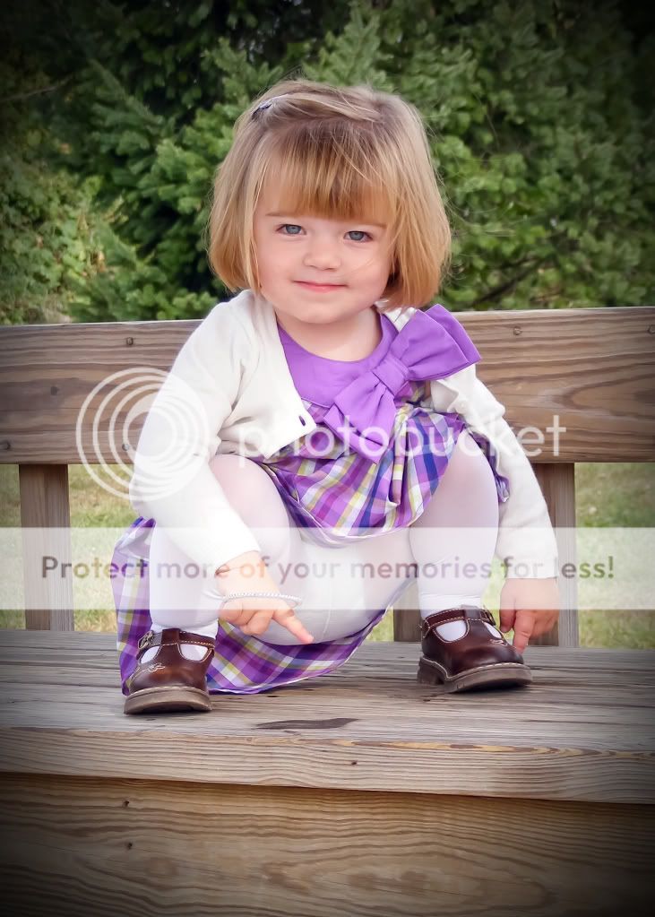
3) Good job getting eye contact! It's crucial to develope a good relationship with your subject. Especially with children, it's common for mom, aunt, grandma, or whoever happens to be there, to try and make the child smile. The result is that you get a kid looking off in every direction except the camera! It's good that you got her looking at you for this one.
That being said... the view is *not* flattering for a little girl. The eye is drawn immediately up her dress. As a parent I might actually be upset to see this image posted online of my daughter.
The focus is soft again, but the colors aren't as orange. The light seems flat here, too, and the vignette a bit heavy.


![[No title]](/data/xfmg/thumbnail/42/42328-c1143adda9734f7d05ce4361e79c27a7.jpg?1734176824)
![[No title]](/data/xfmg/thumbnail/39/39444-02925f6d2859f4fda0e89f2001bfc9cd.jpg?1734173535)