Calibration for printing

I don't recall if you are using Windows, but if so have you checked your settings on display.
I am on a Mac, but it has similar settings. I have "Night shift" and "Automatically adjust brightness" disabled.

Did you go with the Lustre paper and the Linen texture?
Lustre paper (and did soft proofing with the Lustre ICC profile). No linen texture - after trying to scan many old photos on texture paper, I learned to skip anything that will make prints difficult to scan in the future, should the need arise.

I'm curious if there's any difference in proofing in Lr vs PS?
I seem to recall proofing in PS being a little more involved. In LR, you just configure which ICC profile to use for soft proofing, and check/uncheck the soft proofing checkbox in the develop module to preview what the output will look like.
 
Lustre paper (and did soft proofing with the Lustre ICC profile). No linen texture - after trying to scan many old photos on texture paper, I learned to skip anything that will make prints difficult to scan in the future, should the need arise.

I was led to believe that the color of a print is reflective, and that smooth surface would produce a different view then a rough surface (linen texture). Not sure where I even came up with that. LOL

I seem to recall proofing in PS being a little more involved

I do know the export function of Ps allows you to "embed" the color profile in the JPEG, which it is my understanding that modern browsers will look for and use that to display on the web rather then the industry sRGB.

You've really piqued my interest with this thread. I've been dissatisfied with how my images appear after they leave Lr or Ps for sometime, but to lazy to find out why. I actually took some time to research and learn the soft proof process in Lr, since I use it most anyhow. By putting the original and soft proof copy side by side in comparative view I was shocked at how much difference there really is when the image is corrected for the profile, even soft proofing for sRGB. I am still a little confused on when to use "Perceptual" or "Relative". I understand what each does, but one video says "I always use Perceptual" and the next says "I always use Relative" Next test will be to send off some prints for comparison.
 
Last edited:
I wanted to follow up with some examples of the issues I have been having and what the output looks like compared to the original images. One thing that became very apparent is just how bad both of my scanners are, so i wound up using a setup for digitizing large items with 2 opposing softboxes and an overhead camera rig - but that's a discussion for another time.

Here is an example of the original issue I was having with Mpix. With color correction disabled, the colors come out just fine, but the images are too dark.

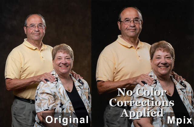
20180708-DSC_8949a-compare-mpix
by adamhiram, on Flickr


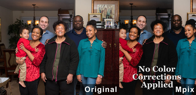
20171225-DSC_5103a-compare-mpix
by adamhiram, on Flickr

However when I enable color correction when ordering prints from Mpix, I am usually pretty happy with the output. My last discussion with them confirmed that the only "color correction" they are actually doing is increasing the brightness. There are some slight differences between the original digital image and the print, but that's to be expected when printing, and nothing to be concerned about.

20180708-DSC_8831a-compare-mpix-corrected
by adamhiram, on Flickr


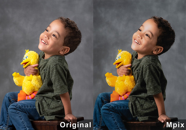
20180610-DSC_8094a-compare-mpix-corrected
by adamhiram, on Flickr

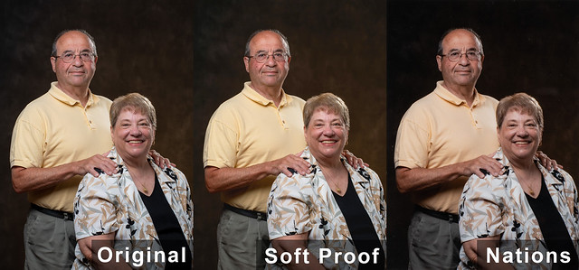
However with the prints from Nations, not only are they darker, but they also show some noticeable color casts, particularly with yellows and colors containing yellows. Soft proofing showed some subtle differences, but definitely did not match the output.

In this one, you can see the man's shirt looks more peach than yellow, clearly showing the orange cast in the yellows.

20180708-DSC_8949a-compare-nations
by adamhiram, on Flickr

Here we can see the greens have a lot more brown to them, and the yellow highights in the background are a bit orange.

20180708-DSC_8831a-compare-nations
by adamhiram, on Flickr

In this one, the yellow stuffed animal looks orange, and the green shirt looks more brown.

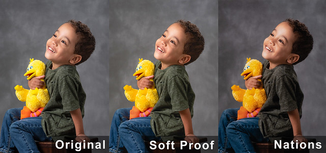
20180610-DSC_8094a-compare-nations
by adamhiram, on Flickr

Lastly, in this photo we can see the yellow glow from the chandelier on the ceiling on the top left appears orange in the print, and the young lady's blue-green shirt on the right is much more blue.

20171225-DSC_5103a-compare-nations
by adamhiram, on Flickr

I still need to figure out the brightness issue, and plan to reach out to Nations for support on the color casts I am seeing, but for now it looks like Mpix is a much better choice for accurate color reproduction.
 
@adamhiram interesting, thanks for sharing and documenting. Couple of points.
  1. In the first example of the man and woman from Mpix. On my monitor I'm seeing a slight color shift in he man's shirt and skin tone, but that could be the darker part you're talking about.
  2. In the second example with color correction from Mpix, I'm seeing color shift in the red of the boy's shirt and the yellow of the duck.
  3. In the last example of Nations, did you both soft proof and use their color correction, or did you just soft proof?
  4. Did you try a test from Nations sending your original (less soft proof), and using their color correction??
  5. Is it possible that you're comparing a backlit screen image to a printed image?
 
interesting, thanks for sharing and documenting. Couple of points.
Thank you for the great feedback! I think the main factor that I couldn't really control for with this illustration was how to scan the prints back in to accurately show the differences. I definitely agree with some of your observations and had to go back to the actual prints to see if those color shifts and differences were there too, or just in my scans/captures.
  1. In the first example, the physical print doesn't show any significant color shift in the man's shirt and skin tone other than being a bit darker. Maybe a little warmer, but much better than the print from Nations.
  2. With the child pictures, I see slight differences in how the red shirt and yellow bird are rendered in the print too, but nothing major. Looking at the physical prints, again it is the one from Nations that actually looks orange.
  3. With all the Nations prints, I did soft proofing after the fact to see if their ICC profile explained the color shifts, which it mostly didn't. I did not use their color correction, as my goal was to have photos printed exactly how I send them without someone else making those decisions.
  4. No, I did not try their color correction. I confirmed with Mpix that they did not edit my colors at all when I enabled color correction, just the brightness - at least for these particular photos. I was hoping this would be the case with Nations as well.
  5. All I can really do when comparing a backlit screen to a printed image is to look for specific colors or details in each photo and ensure both are acceptable. I fully expect there to be some differences, but yellows shouldn't be orange, and greens shouldn't be brown.
Thanks again!
 
@adamhiram I went through some really strange color issues over the past few months, partly software, partly hardware and partly don't have a clue. Like us part of it could be differences in hardware/software/processing at the labs. I believe you when you say Mpix told you they only change brightness in color correction but I wonder if the person you talked to really understood what they were talking about. In my case the images sent to Mpix with reddish cheek skin tones came back objectionable Orange. I do agree that your comments about the brightness and gamma of the screen have a significant effect on hue and the brightness/darkness of the final print. Just out of curiosity have you double checked your images on other devices? Lastly ambient room light on is always going to have an effect.

When you send images to the lab without soft proofing I'm assuming you are exporting as sRGB. Are you then checking that image against the original? I've noticed that if I softproof my image using LR's standard sRGB I'm seeing some shifts. The sRGB standard supports a greater diffuse white and wider gamut.

Some observations on softproofing in LR-
  1. I'm finding in LR "perceptual" is far more restrictive on out of gamut then "relative".
  2. Almost none of the images I've proofed have required any adjustments to exposure, and those that did were more of a discretionary afterthought over the original.
  3. Saturation adjustment was required to bring the images back in range. Either global, targeted, or via adjustment brush. Some of which were significant adjustments.
  4. Generally the primary colors were the most prone to be out of gamut. I suspect that the screen brightness plays a factor in this.
 
Last edited:
I went through some really strange color issues over the past few months, partly software, partly hardware and partly don't have a clue. Like us part of it could be differences in hardware/software/processing at the labs.
The bottom line for me is that I understand that prints won't match my original images exactly, and am fine with that if it means I can just send my images to be printed without having to spend any additional time tweaking each one. I expect to see colors that don't match perfectly, some differences in contrast and saturation, and I am generally okay with that.

I use a 27" 5k iMac for editing, which has been reviewed as a decent display for photo editing, and I re-calibrate once a month with a Spyder4Pro. Ambient light is moderately low, with sunlight mostly blocked by a room darkening blinds, just one lamp in the corner with a 60W equiv LED bulb, and no direct light hitting the screen. I typically check on several other devices before posting or printing anything, and I've found that a recent model iPhone or iPad with screen brightness set to auto tends to pretty accurately reflect what others will see, even if they aren't technically calibrated and tend to be on the bright side. I export images from LR as sRGB, and never found any real differences between the exported image and the one I am working on in Lightroom.

Let me try a different approach for the brightness issue. I still want to figure out if the root cause is that my source files that are too dark, or if I just need to bump up the brightness when using these printing services. If the problem is on my end, I would guess it is due to my screen being calibrated too bright, which would result in my final images being too dark. This is what Mpix support suggested, although I am using the recommended settings from my calibration tool based on the ambient light levels detected. However I meter my strobes for any portrait work I do and rarely need to adjust the exposure for those images in post, so I would be surprised if that is the issue.

I am interested to see if others with calibrated displays consider these images properly exposed.

In this image, the background should have a just-visible texture of dark browns, and should not appear to be black or a dark solid color. The man's hair should be lit just well enough that it doesn't disappear into the background.


20180708-DSC_8949a
by adamhiram, on Flickr

And in this image, the background should appear to be a medium gray, with just enough fill light on the shadow (right) side to still see the texture in the child's hair.


20180610-DSC_8094a
by adamhiram, on Flickr

Do you see the same exposures and details that I described, or something different?
 
Do you see the same exposures and details that I described, or something different?

I worked on just the first image. First let me clarify, something about TPF and other social media sites seems to crush images, so there is a slight difference between what I first see on the site, versus what I see when opened on Flickr. I used the Flickr image for comparison. On my tablet there are slight difference, but not significant from what I see on my calibrated monitor, which I would expect. When I downloaded the image into PS there was no significant between what I see on Flickr compared to the view in PS.

In this image, the background should have a just-visible texture of dark browns, and should not appear to be black or a dark solid color. The man's hair should be lit just well enough that it doesn't disappear into the background.

The Flickr image I'm viewing on my tablet, monitor, and in PS are as you describe.

I sampled the mans shirt, averaged the color and did are reading. Here's what it showed.
shirt 1.JPG


I sampled the forehead on the woman, averaged and here is the result.

skin1.JPG


Maybe this will help if you sample your original to compare. As a footnote I tried to bring your images of the Mpix and Nations examples into PS. The color shift to red was over the top bad. So bad I didn't bother sampling. Not sure what's up with that.
 
The Flickr image I'm viewing on my tablet, monitor, and in PS are as you describe.
Thank you very much, I think that tells me what I really needed to know - are my source images too dark from editing on too bright of a display, or are they just printing dark. It sounds like you were able to confirm it is likely the latter. I will reach out to Nations this week to try their color correction, but in the meantime I may opt to just stick with Mpix + color correction.

It sounds like you were able to confirm the strong color cast on the prints, although I'm not sure if the Mpix one really has a cast or if it was how I scanned it - the print didn't show that much of a red shift. Thank you very much, I appreciate your help in analyzing this and working through it!
 
It sounds like you were able to confirm the strong color cast on the prints, although I'm not sure if the Mpix one really has a cast or if it was how I scanned it - the print didn't show that much of a red shift. Thank you very much, I appreciate your help in analyzing this and working through it!

No problem as I'm watching and learning from you on this as well. Just to be clear when I talked about the examples Mpix and Nations where you showed the original, soft proof and their image, the red shift wasn't that noticeable when viewing on Flickr. It was ONLY AFTER I imported it into PS that the red color shift took place - at that point it was huge.

Something else that's fairly common is if you can determine a pattern then you can set a preset to automatically correct it. IE: all my prints are to dark = preset that bumps exposure by X amount on all prints sent to ??? I'm still not sure that even using a lab's profile will result in the exact same results given the differences in equipment. One thing to be aware of is if you start changing monitor brightness or gamma, will that only affect the profile of that lab or will it be an across the board change which will also affect your web images?

Edit Footnote: I forgot to ask, are you soft proofing in PS or LR. I use LR because the process is much easier. Click the drop down list and go. In PS it requires more settings changes. Also, when you don't soft proof to their profile, are you just exporting as sRGB and sending the file or do you still soft proof to sRGB. LR offers two profiles, sRGB and sRGB IEC 61966-2.1. I can't remember where I read it, but it's my understanding that when there is not a specific profile embedded, labs will automatically machine match to sRGB IEC 61966-2.1. In playing around with it, I've noticed there are some subtle differences between the two.
 
Last edited:
I think the differences you are seeing between Flickr and Photoshop are my fault. Any images I export from Lightroom automatically get the sRGB profile embedded, while my PhotoShop exports don’t have any embedded profile. I have a feeling your browser is making some (correct) assumptions about the color space, while Photoshop is probably just using whatever default color space you have configured.

Your comment on monitor brightness hits the nail on the head with my original concern. Mpix suggested turning down my brightness, which would lead to me increasing the exposure of my images, and ultimately brighter prints from them. However if my monitor is already calibrated to an appropriate brightness (as you indirectly confirmed earlier), the end result will be overexposed digital images, but correct prints. Your suggestion of creating a separate preset when exporting for printing makes a lot more sense here.

I usually don’t soft proof at all, but when I do I use Lightroom since it is just a simple checkbox in the develop module, and ultimately what I use for managing images. I export to sRGB, since that is what most labs ask for and most browsers will render to.

Ultimately, I just want my display calibrated such that my edits will look the same on any other properly calibrated displays, while also being able to get accurate output through a professional printing service without having to edit everything a 2nd time. It doesn’t seem like that should be too much to ask!
 
I usually don’t soft proof at all,

And therein might be a source of some of the problems. I've also had several conversations with Nations trying to understand. There can be subtle differences between an image you export as a sRGB and one that you've first soft proof using the sRGB IEC 61966-2.1. I profile, as that is what the machine are calibrated to. The differences can be even more striking if you've spot edited your images. Even if you pay for color correction I verified that Nations will only make global adjustments to the brightness, color tone (WB), and saturation. If you've made significant spot edits you could be out of gamut in those spots even after they do their color corrections, causing them to overadjust to find a middle ground.

Ultimately, I just want my display calibrated such that my edits will look the same on any other properly calibrated displays, while also being able to get accurate output through a professional printing service without having to edit everything a 2nd time

And I would like to win the Powerball, but I doubt that will happen either. LOL There will always be some differences. As to printing, whether you use Mpix, Nations, or XYZ, there should be a uniformity within that lab. Once you determine the basic adjustments required it's fairly easy to apply a custom preset across the board to a batch of images.
 
My understanding is that a printer's color space is a lot smaller than what we see on our screens, and the whole point of soft proofing is to simulate what an image will look like in that reduced color space. I should be able to send an image that was edited on a calibrated display and saved in the sRGB color space and the printing service should be able to make it look close to what the soft proof showed. If one particular printer tends to print images too dark, or yellows come out orange, that's not something the customer should need to adjust for.

In the examples I provided, there were some differences between the original image and the soft proof, but there were no changes in brightness, yellows weren't orange, and greens weren't brown.
 
My understanding is that a printer's color space is a lot smaller than what we see on our screens, and the whole point of soft proofing is to simulate what an image will look like in that reduced color space. I should be able to send an image that was edited on a calibrated display and saved in the sRGB color space and the printing service should be able to make it look close to what the soft proof showed. If one particular printer tends to print images too dark, or yellows come out orange, that's not something the customer should need to adjust for.

Not really, but it is a different colorspace as there are different limitations on how they display colours there are different colours that are affected by those limitations..

We are looking at two different colour systems here, the additive system of your computer screen is only generating three narrow bands of colour, red, green and blue, it doesn't display any other wavelength or colour at all. This works because it stimulates the same receptors in your eye as say yellow does. Prints are a subtractive colour system so actually reflect, or try to reflect the correct colours.

This means there are some glaring differences between how you see colour on your screen and how you see it on the print. Screens generally don't display subtle differences in saturated reds very well, they have a different contrast to prints, (which affects your perception of colour).

In short the soft proof is only a simulation on your computer screen of what the print will look like and in producing it it makes certain assumptions about the viewing conditions as regards to brightness and WB of the light you view the print in.

However...

In the examples I provided, there were some differences between the original image and the soft proof, but there were no changes in brightness, yellows weren't orange, and greens weren't brown.

It sounds as though you're describing the colour of the paper. With subtractive systems of print the colour is translucent and really acts like a filter. The light reflects off the paper base and is filtered through the pigment so the colour of the paper affects the colour you see. Soft proofing tries to simulate this but only if you have *show paper colour* turned on. With Epson Lustre it is slightly magenta and shows in the soft proof, though when printing through PS with PS managing the colours it does try to correct for this giving as close to reference as possible. Other setting affect this such as how out of gamut colours are converted, and of course it's not possible to hide this in areas of white or bright colour, (pale yellow for instance). Here is you original file downloaded, next to the soft proof showing paper colour, and the soft proof with a rough correction for magenta, (it's a little stretched to believe that the shift in hue the slider evokes is a match to the shift produced by the paper). This might be what you're seeing as your soft proof doesn't appear to be showing the paper colour:

ex-1.jpg
 
Thank you for the explanation @Tim Tucker 2 I'd completely forgot about the color of the paper!
 

Most reactions

Back
Top