But I have been looking these over and if you really want good C&C only post at most 3 of your best. And really nothing stands out but Ill try ccing the technical part. And this in all IMO.
#1 good use of the rule of thirds but could've used a wider crop.
#2 too much dutch tilt, and whats the subject? I think it might be the flowers but they aren't really in focus. the wood is though.
#3 again the tilt(personally i don't like tilt) but the flowers seem to be in focus.
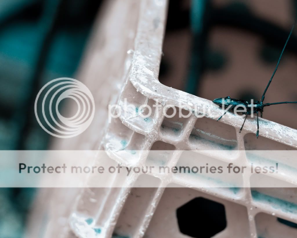
#4 clipping of the antenna and thats bugging me!
#5 too saturated and the bug is hard to see in the shadow.

")