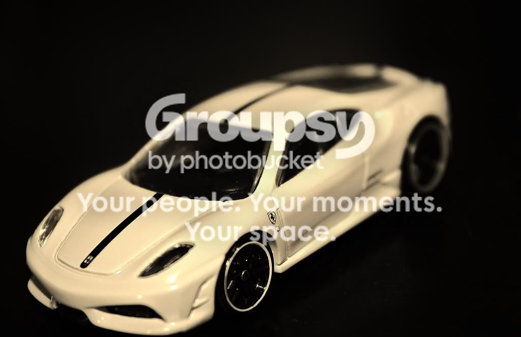
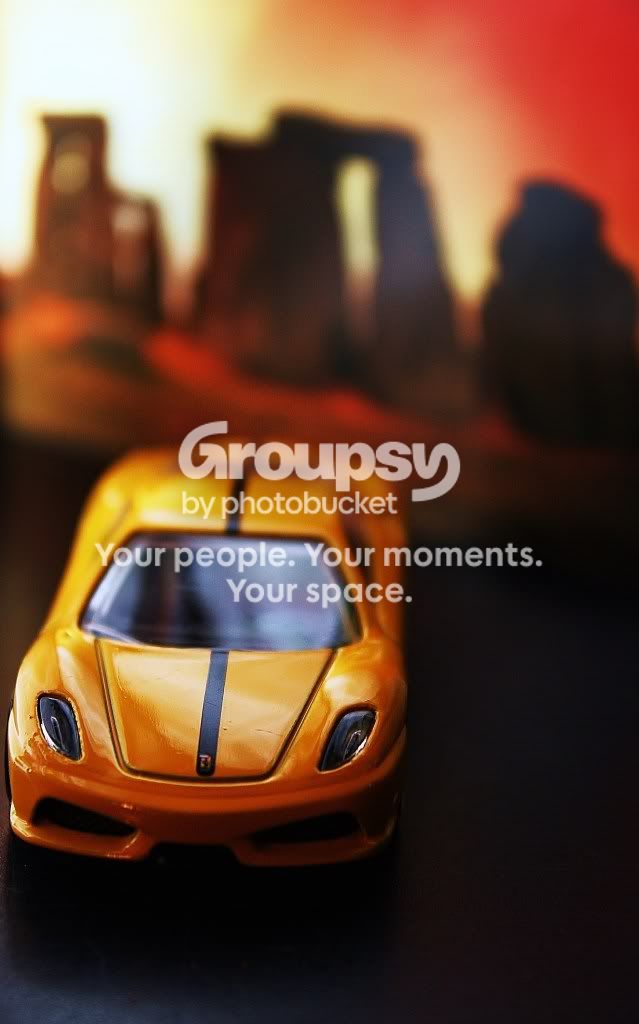
like the idea of the second one..color is strong whatever lighting u used.. the first one the wheel is a little distracting... seems to be what draws my eye in the photo.. maybe change the angle..
- kinda looks like a tilt/shift effect...not sure if this is what you were going for
- color looks too retro..i would bring up the white on #1 and the vibrance/contrast on #2
- I would've shot on eye level instead of shooting down on it
- Cleaner crop on #2 would've helped
- I see you shot @ f5.6...I would've opened it up more..maybe f3.5?