What's new

CC A Few Photos

derajfast

TPF Noob!
Joined
Sep 17, 2009
Messages
2
Reaction score
0
Can others edit my Photos
Photos OK to edit
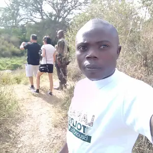
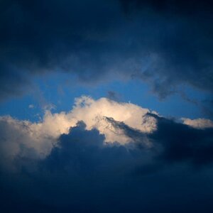
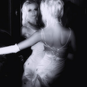
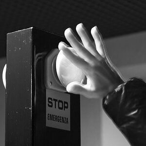
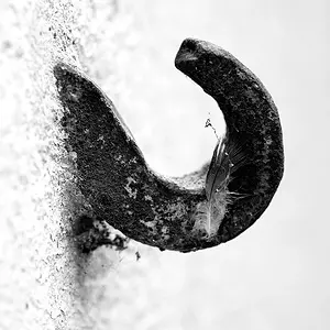
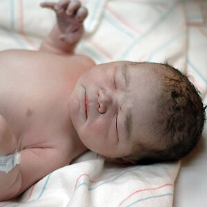
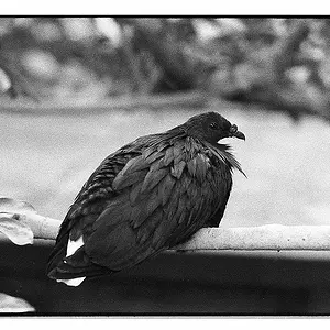
Most of these were taken in the last few months in India/China, though there are is one of the US Open in NY, and a subway there as well. Please let me know what you think, what could improve these, what works and what doesn't. Thanks for all your input. Check out Flickr: derajfast's Photostream for more photos if you would like.


i love the first 2.. #1 has such a moody feel to it, great job! I just love the colors in #2.. the rest don't do much for me..
 
thanks for the feedback. if you had a chance to check out my fickr, were there any other photos that you liked?

thanks
 
I like number 1. It almost seems a tiny bit under-exposed though. I would like to see the shadows lightened a little bit. Not sure how to do it without blowing out the overhead lights. But I love the B&W, the symmetry, and the person's back. Very nice.

I like number 3, I just would almost like to see a wider angle. I would have liked to see the top to the building to make the people appear even smaller, but its a cool shot.

I think number 4 had potential. It would have been more interesting to not shoot the building straight on. Off to one side more, and then what would have been awesome would have been to frame that moon in the opening of the building near the top left. Just my opinion though......
 
You have a fine eye. Most of these need only very minor, minor corrections to bring them up to a very high level. Shot 1 of the man with suitcase in the subway tunnel needs a bit of lightening, otherwise,excellent.

The shot of the boy doesn't do much for me. The architectural shot could use a minor clockwise rotation of maybe 1.5 degrees. I like the symmetrical composition and the forma balance in that shot.

The building with moon needs a slight clockwise rotation and a minor cropping to get is squared up. I would leave the tennis player alone, but consider a border to enclose the frame. The tomato ladies shot--crop out the woman on the far right hand side,and it'll be stronger. The refugees or whatever looks fine as it is, as does the eclipse shot.
 
The only one that really jumps out at me is the first one. Lightening it up a bit may make it a better shot technically, but I love the moody feel of it just as it is. I love the shot in b&w, the symmetry, the mood, just an all around solid shot. Would make a very nice print.

The rest are good, but nothing really stands out to me. I agree completely with the rest of Derrel's comments.
 

Create an account or login to comment

You must be a member in order to leave a comment

Create account

Create an account on our community. It's easy!

Log in

Already have an account? Log in here.

Back
Top Bottom