What's new

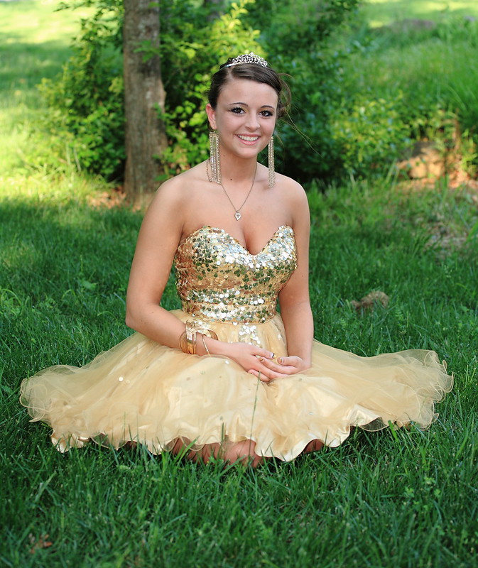
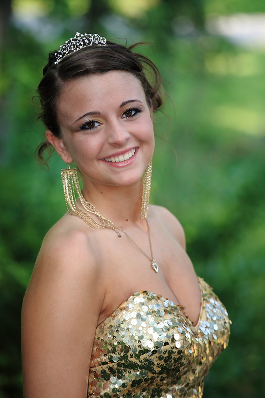
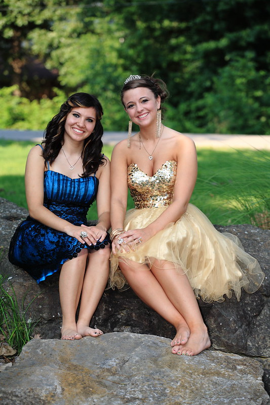
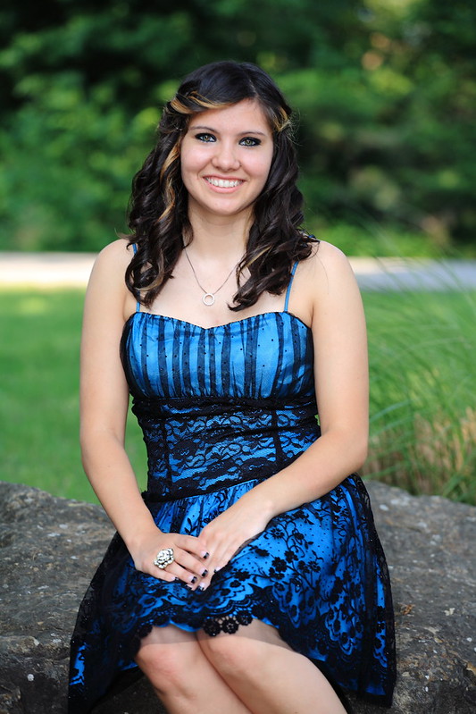
CC A few Prom pics

Carny

No longer a newbie, moving up!
Joined
May 15, 2011
Messages
216
Reaction score
29
Location
OK
Can others edit my Photos
Photos OK to edit
Last edited:
No one has anything to say? Should have said I was going to charge for them!
 
Bueller?

I ended up bumping the exposure up just a bit on #2 (not shown here). Anything else I need to change? Would any of these be good enough to charge for?
 
not too shabby! The outfits are a bit formal for park wear but very pretty.
 
No one has anything to say? Should have said I was going to charge for them!

That would have got some responses lol. I liked #2 the best due to the depth of field. On my monitor #2 seemed a little underexsposed but my monitor is not calibrated so my opion there is worthless. Nice job with the pictures.
 
not too shabby! The outfits are a bit formal for park wear but very pretty.

It was a spur of the moment thing. She's my neighbor and whoever was supposed to take the pics backed out, so we shot those in my yard.


No one has anything to say? Should have said I was going to charge for them!

That would have got some responses lol. I liked #2 the best due to the depth of field. On my monitor #2 seemed a little underexsposed but my monitor is not calibrated so my opion there is worthless. Nice job with the pictures.

I upped the exposure a bit in #2, just didn't update it here.

Anyone else have any ideas on how I could have done these better? What's the best way to handle the bright spots in the background?
 
Hmmmm, I don't really like the first one. The pose is kinda crappy, might have been better if she were standing to get a full shot of the whole outfit. The second one is nice but def bump the exposure (which you said you did). Also her stray hairs bother me, I know it's part of the style but they bother me. Makes me think her hair is all messed up.

Overall they are nice but I would think that (as a girl) they would have wanted the full shot of the shoes on their feet standing movie star style.
 
We had plenty of standing shots. She wanted this one and it's actually her favorite. What part of the pose is "crappy" (which is a poor word choice for a critique, btw)? The way she held her hands and arms could be better, just not sure how exactly.
 
I just don't like the pose that's all. If she is happy with it then by all means celebrate. It's not a pose that screams professional photographer. She looks stumpy because she has no legs. I don't feel like this is a strong image and if you have others that are full shots of the dress/shoes/hair/jewlery then great. Just my crappy opinion, geez.
 
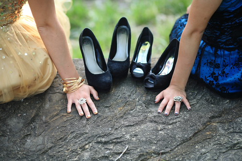
You did a nice job, and I'm sure the girls really appreciated them. The light is flattering. I think all of them could have benefitted from a larger aperture/shallower dof. I think you would have been more pleased with the way the sunlight looked in the background. For posing, it often helps to make the image more natural when you ask your subject to lean in or raise one shoulder a bit by bending their back. For the first picture, it would have been preferable to have her sit more on her hip and have her legs come out to the side more, so the viewer could see them. In the second one, having the subject raise their arm out away from their body just a tiny bit helps to make the upper arm look more slender...always a good thing to keep in mind! In 3, the feet look a bit awkward. it might have come across better to have them point their toes a bit to elongate their legs. 4 is nice, but having her turn her body a little bit helps to slenderize, which would be a bit more flattering. Love the last one. My only suggestion there would be for the girls to have not actually put weight on their hands so their wrists could be a little straighter. I think it would have been just as effective if only their fingertips were touching the stone. I hope that helps a bit! Overall, I think you did really well. :)
 
I like the first one and the last. The first one is elegant. The last one is unusual which in my opinion stands out. I know I have different opinions than others, because I like the opposite effect. A formal dress in an old barn or in a natural setting or casual clothes in front of a warehouse or unusually setting. To me this is what makes the person stand out, and not blend into the picture. The human brain notices the contrast, because it does not normally the subject and scenery does not go together which = the person being the center of attention. You did a good job at the last moment!
 
Very nice work. Two and five are my favorites.
 

Create an account or login to comment

You must be a member in order to leave a comment

Create account

Create an account on our community. It's easy!

Log in

Already have an account? Log in here.

New Topics

Back
Top Bottom