What's new

City and River

Joined
Aug 6, 2012
Messages
5,529
Reaction score
7,102
Location
near St Louis
Can others edit my Photos
Photos NOT OK to edit
Beginner here. I was looking for tonal range when shooting. Any C&C welcome.

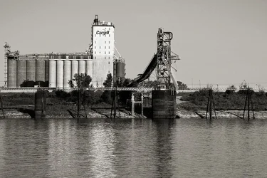
1. ACR for initial conversion and 10 adjustments masks in PS

IMG_0500_2BWc by Cheryl3001, on Flickr

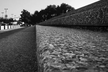
2. ACR and 3 masks in PS
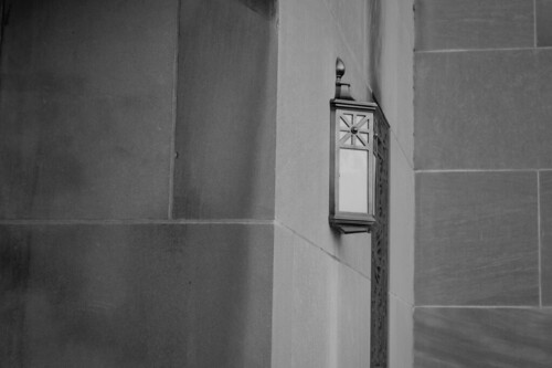
IMG_0492_2bw by Cheryl3001, on Flickr

3. Cropped version. ACR and 4 masks in PS. I was hoping for a more dynamic shot with this one, but seems cluttered.

IMG_0509_C by Cheryl3001, on Flickr
 
I like the way you are working the lines in these. C&C from me would be try and get a little stronger subject in the photos.

Welcome to the forum.
 
I agree with Lew. There are no real highlights in any of these and the mid-tones seem compressed.
 
Thanks for the welcome and the C&Cs. I'll keep trying and will look for more light when shooting. Maybe I was too conservative in PP too. I have the color versions of the first two on Flickr. Do you think the photos are not suitable for black and white? Thanks. :)
 
Thanks for the welcome and the C&Cs. I'll keep trying and will look for more light when shooting. Maybe I was too conservative in PP too. I have the color versions of the first two on Flickr. Do you think the photos are not suitable for black and white? Thanks. :)

They are fixable to have better range but they really don't have much in them of interest.
Why would we want to look at them?
What are you looking at?
What are you showing us?

Here is a better, imo, tonal range. It has great leading lines - but they aren't leading to anything and the geometry is ok but not different in any way.
 

Attachments

  • $8043580872_ca02e52d09_blll.webp
    $8043580872_ca02e52d09_blll.webp
    86.4 KB · Views: 120
#1 is a pretty decent example of something I find viciously hard to shoot. Factories should be so interesting. They're visually super cool in real life, and they turn into uninterested crap when you stick a frame around them. This isn't a particularly good photo, but it's better than most of this genre, and it's a hell of a good try. I kind of like the tonal range in it -- you're pretty close to full range here, but there's lot of greys and you're letting them breathe. The picture just isn't that interesting, though.

I like #2 pretty well. It has a tilt to the right, the central line should be vertical, I think. If Bitter Jeweler had posted it the fanboys would be gushing all over it, ooo, aaa, it's sooo abstract. And, it IS a good abstractish. The black tones are actually ok, I do thing you could stretch the range upwards a little, but hopefully without losing the grey tones and the more importantly the grey mood that goes with it. The geometry is excellent. As-is it's a little off-kilter, straightened to vertical it would be a different photograph, and possibly a better one. I'd have to see it to be sure, though.

#3 is, as Lew points out, a great example of leading lines going noplace. I think his edit for contrast has gone too far, again I would just push the lightest tones up a touch and stretch the middles out a little bit, leaving the lovely selection of greys you have once again found to breathe.

I personally like the way you're handling tonality here, overall. The current trend is toward ever more contrast, and I hate it.
 
Thanks for the welcome and the C&Cs. I'll keep trying and will look for more light when shooting. Maybe I was too conservative in PP too. I have the color versions of the first two on Flickr. Do you think the photos are not suitable for black and white? Thanks. :)

They are fixable to have better range but they really don't have much in them of interest.
Why would we want to look at them?
What are you looking at?
What are you showing us?

Here is a better, imo, tonal range. It has great leading lines - but they aren't leading to anything and the geometry is ok but not different in any way.

I would have to honestly answer "no" to all 3 questions. When I was shooting I was thinking more technical...lines...and not overall interest. There was a family at the river's edge throwing stones and I tried not get them in the shots. Maybe I should have focused on them. Thanks for the feedback.

I looked at your website and loved #13 in Random Street Shots.
 
#1 is a pretty decent example of something I find viciously hard to shoot. Factories should be so interesting. They're visually super cool in real life, and they turn into uninterested crap when you stick a frame around them. This isn't a particularly good photo, but it's better than most of this genre, and it's a hell of a good try. I kind of like the tonal range in it -- you're pretty close to full range here, but there's lot of greys and you're letting them breathe. The picture just isn't that interesting, though.

I like #2 pretty well. It has a tilt to the right, the central line should be vertical, I think. If Bitter Jeweler had posted it the fanboys would be gushing all over it, ooo, aaa, it's sooo abstract. And, it IS a good abstractish. The black tones are actually ok, I do thing you could stretch the range upwards a little, but hopefully without losing the grey tones and the more importantly the grey mood that goes with it. The geometry is excellent. As-is it's a little off-kilter, straightened to vertical it would be a different photograph, and possibly a better one. I'd have to see it to be sure, though.

#3 is, as Lew points out, a great example of leading lines going noplace. I think his edit for contrast has gone too far, again I would just push the lightest tones up a touch and stretch the middles out a little bit, leaving the lovely selection of greys you have once again found to breathe.

I personally like the way you're handling tonality here, overall. The current trend is toward ever more contrast, and I hate it.


#1 Thinking now, the factory would probably be of interest to someone who had worked there.
#2 I did straighten a tad and good to know it could be better. I took a few more of the building. It is the old Keil Opera House and I went to a lot of concerts there (rock) in the 70's. So the fixtures do bring back memories. But, I can see they would have no interest to anyone else.
#3 I see that now they lead to nowhere.

Thanks for the feedback and the tonal range, much appreciated.
 
Hi Neighbor,

That's not a factory in photo 1 that's a loading dolphin in front of a grain elevator. Good place to fish just down river cause they spill a fair amount of grain when they load the barges.

Your B&W conversions are tending on the flat side. How about this:

Joe

$grain_elevator.webp
 
Hi Neighbor,

That's not a factory in photo 1 that's a loading dolphin in front of a grain elevator. Good place to fish just down river cause they spill a fair amount of grain when they load the barges.

Your B&W conversions are tending on the flat side. How about this:

Joe

View attachment 21759


Your version looks more like mine in PS, maybe bumped up a bit. Thanks. Yes, it is a grain elevator. We have a lot of those around here.
 
Hi Neighbor,

That's not a factory in photo 1 that's a loading dolphin in front of a grain elevator. Good place to fish just down river cause they spill a fair amount of grain when they load the barges.

Your B&W conversions are tending on the flat side. How about this:

Joe

View attachment 21759


Your version looks more like mine in PS, maybe bumped up a bit. Thanks. Yes, it is a grain elevator. We have a lot of those around here.

Yep, I'm familiar with that particular one -- I see it a lot. Around here we also call them prairie castles.

Joe
 

Create an account or login to comment

You must be a member in order to leave a comment

Create account

Create an account on our community. It's easy!

Log in

Already have an account? Log in here.

Back
Top Bottom