OK but I would crop tighter getting rid of blank space at top & bottom.
But why do you think it is blank space? If you cropped it out then you would be left with the darker clouds, and then wouldn't they become the blank space? Think yin and yang, shapes and colour do not exist unless they are outlined/silhouetted against something that is different or contrasts. As a wise man should've said, "black square only exists against white background and disappears against black background. So maybe not always wise to remove white background..."

Some points though:
1) Watch the colour balance. Not because it is neutral or correct, but because colour works in contrast and having the same hue present in all colour (AKA white balance or colour cast) can sometimes reduce the contrast between colours and therefore the impression of colour.
2) You're presenting a picture that's all about symmetry on the horizontal axis, so get the horizon straight. You've given the viewer two strong horizontal lines at the top and bottom of the from with which to judge and compare so you better make sure you've got it right. Use the reflections (the crane) on the vertical axis to line it up.
3) You've presented a background that's symmetrical on both the horizontal and vertical (as good as symmetrical) axis, except for one thing (the boat). So accent it by centring it on the vertical axis (be exact), it makes no sense having it slightly displaced in all reference to the frame and so of lesser importance.
4) Reflections are always darker than the reflected so subtle or noticeable, make it so because it looks balanced and equal that way. Also it is expected that the scene has some darkness so resist the urge to lift the shadows too much. Accent the broader picture instead of the detail.
Not my taste but a cool shot.


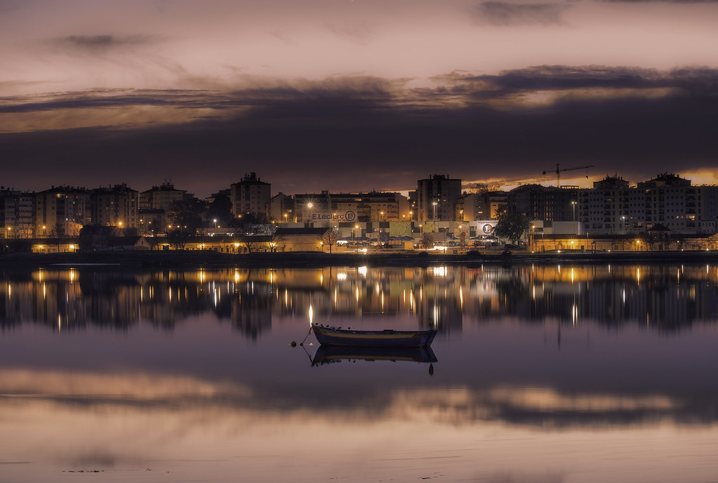 City Reflections by Daniel Boavida, no Flickr




![[No title]](/data/xfmg/thumbnail/41/41893-f4e56dae79851bac6e79639bcf9e7473.jpg?1734176246)
![[No title]](/data/xfmg/thumbnail/37/37136-40f690dc7da693c09d7c99c3782954b8.jpg?1734169835)
![[No title]](/data/xfmg/thumbnail/41/41894-692c98920dde335de241400937ed6166.jpg?1734176247)