What's new

Clarifying Boiled Green Peanuts

ceeboy14

TPF Noob!
Joined
Dec 5, 2012
Messages
2,566
Reaction score
788
Location
Florida
Can others edit my Photos
Photos OK to edit
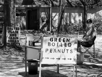
Re-empahsized the sign more to draw attention to the stand but also enhanced the background to draw more attention to the seller. Original is first, redo second.
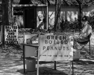
$8563459346_03c706c47b_o.webp

$8564693271_d0b155263d_o.webp
 
Last edited:
Could you post the original in this post, so I can see the difference please.
 
Last edited:
Just did.
 
I just caught up to this (and the other) thread. It seems to me to be a perfectly good documentary photo, but as a pure "fine art" photo, I'm not so sure. The background is very busy and seems even more so in the redo where it has become more contrasty along with everything else. I would try more contrast on the sign and the man only, and would also darken the background.
 
Hey CB, I don't like your re-take. I think the sign is blown out, The original may be a little flat but better then the 2nd attempt. I think Ken has the answer

I'm going to stand by my original response. I liked the original. It's not a wall hanger, but to me photography doesn't have to be all about wall hangers.
I have the deepest respect for Lew's ability. He's a top knotch photographer, but to me photography is like woodwork. There's fine woodworking with mirror finishes, then there's folkart wood carving. Crude and expressive. I enjoy both. Likewise, I enjoy a fine Ansel Adams print but I also enjoy a casual street shot taken with a 1950's folder. Just my opinion with no attempt to start another food fight.
 
Last edited:
I never shoot with the intent it is going to be a wall hanger, fine art print. I shoot those things which I find interesting and on occasion (more now than earlier in my digital career), I get the wall hangers. thanks for all the comments. I'll probably merge the two images into a keeper at least for me.
 
Is it about the sign(s), or the guy? The reworked one makes it about the sign.

The original seems to be about the signs, the guy, and their relationships. That's a lot more interesting. Unfortunately, the original is also kind of visually confusing, the signs and the guy are not well separated from the background, which seems to be what the rework was about. I think some burning and dodging to bring the three elements forward equally might be a sound approach.
 
Don't comment much, learn more by reading other's comments.
liked this one as a true slice of roadside Americana.
Definitely a worthwhile picture, just so many elements to balance and no chance to eliminate any.
 
I think both Rick and Amolitor have said it the best. The things you were critiqued on in the other thread aren't anything that warrant a re-work: yes, there is some junk and clutter, but that's what was there and it's integral to this particular scene: a country roadside vendor. So, no, with that in mind, you won't get the fine art medal, but so what? Once you let the foreground sign darken up a bit again (yes, it's blown), it will have a more even look. I also like how the signs lead the eye naturally from left to right, so you come to rest on the vendor. If he was completely out from behind the center sign that would be ideal, but it's not killing the shot. And he is a perfect representation of a Southern roadside vendor. I've seen many. ;)

Too bad the peanuts were too salty. :razz: I love 'em!
 

Create an account or login to comment

You must be a member in order to leave a comment

Create account

Create an account on our community. It's easy!

Log in

Already have an account? Log in here.

New Topics

Back
Top Bottom