What's new

Clear Creek Falls

Part of what I like about #1 (though I'm not sure it's very evident to anyone who didn't see it in person), is the mist on the right side. In the closer shot of #2, you can't see any of it.
 
Apparently, you were able to move just enough to get that tree out of the way fro #2. You should have taken another shot of the entire scene at that spot.

#1 and 2 are two completely different images, and are meant to convey two completely different feelings. The way I see it: Whereas #1 is a scenic view of the waterfall and surrounding area, #2 is a closeup portrait of a lonely tree... on a cliff... right in front of what seems like an epic waterfall. I don't think you really can compare the two images and decide which are the better one, because they are completely different. I get a sense of pride yet loneliness. Strong and remote. Anyway, it's not perfect, IMO. Some distracting trees in lower part of the frame. I also think the tree should be brighter. And one can always introduce some mist in photoshop ;) (maybe I added too much, but just to demonstrate). I just tried to make it "pop" a bit more.
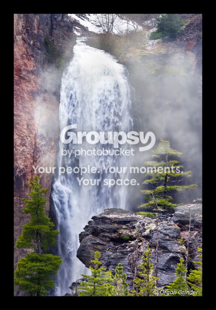
7325795628_2ece5a36b1_bedit.jpg
 
I much prefer picture #1 over #2. Compaq's post completely echos my point of view.
 
Are you sure you got your numbers right, Joel? :) Or maybe I'm just dumb :D
 
Sure, maybe the focus isn't perfect. And that would be a problem for large prints. However, I still prefer the composition. :thumbsup:
 
Well I think I'm about to head out there again. I'll try to retake the first photo from a better spot to get the tree out of the way and get a shot with a slow the shutter speed. Then I'll try to retake the second shot but use my 55-250 kit lens that can be used on my tripod for a sharper picture and a slower shutter speed...
 
Are you sure you got your numbers right, Joel? :) Or maybe I'm just dumb :D
Sorry if I once again caused some confusion. I was referring to your statement that each picture convey a completely different feeling.
 
Thanks to all for the suggestions! I think the reshoot went well. I posted on a new thread and would love any new thoughts and suggestions.

By the way, compaq, I really like the edit you did! Gives it a lot more character.
 

Create an account or login to comment

You must be a member in order to leave a comment

Create account

Create an account on our community. It's easy!

Log in

Already have an account? Log in here.

Back
Top Bottom