What's new

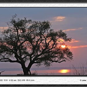
Comparison between heavily edited digital photo and BW film version with contrast adjustments

Which version of the landscape photo do you prefer?


  • Total voters
    7

Compaq

Been spending a lot of time on here!
Joined
Aug 29, 2010
Messages
3,400
Reaction score
657
Location
Norway
Can others edit my Photos
Photos OK to edit
Took these during the Easter holidays with my Canon EOS 300 and a Cosina 28mm/2.8.

1) FP4+ in Rodinal 1+50, scanned with Epson V600


2) Multiple-exposure HDR and tonemapped version


So, which one do you prefer? :)

Anders
 
color.
definitely the color.
 
I shot a lot of Tri-X 400 and developed it on Rodinal in the mid 1980's...and now, I regret almost every single exposure developed in that salt-and-pepper soup...and I really don't like tone-mapped light-from-everywhere color work....given that, I have a strong preference for the color shot. I can't figure out how you got Rodinal's normal, exaggerated, high-acutance grain to look so positively overboard in such a small image size.Maybe it's the scanning? Color, definitely the color.
 
I think the color is more pleasing, but the B&W lets one know how far away that body of water is.
The color version makes the tree look like it's right next to a small pond.
I guess it all depends on what most closely matches your mind's eye.

And people think photography is about capturing reality ... ;)

What's that saying? A photo is made, not taken?
 
I can get over the grain in the B&W but the color is so over processed that it looks like it was done in crayon.


Sorry but neither actually appeal to me.
 
bw all the way. The tonemapped processed fake stuff usually interests me for about two seconds then ends up in my mental dumpster.
 
Color shot? Oh no, no, no, no. I think I actually physically recoiled when I saw it. No. Even with the grain, the b&w is SO much better. Would I still feel that way if the color shot weren't so cooked? Dunno. All I know is when I look at the b&w version, my eyes spend some time wandering around the image, noticing details, enjoying the view. When I look at the color version, I squint and want it to be over.
 
Ease up on the degree of sharpening being applied on scenes like this that have higher frequency detail...both of these fairly well "vibrate" due to excessive sharpening.
 
Neither.

The BW just doesn't grab me at all; feels "old" and could hold a nostalgic value to some because of that old look, but its not really making me think its a great photo - its just a photo.

Colour - ok now I like this a lot more - the background of the lacke and the sky and the littley greyer parts of the hill all work, in my view, really well. You've an almost dreamy sense to the way the water reflects (interestingly no reflections caught at all in the BW - in that the water is much more "dead dark").

However the foreground in the colour feels overcooked. It's just a bit "too" much - especially in the red tones. I think if it were tonned back a little more in the foreground in the colour it would make it all the stronger
 
I think you can get so wrapped up in producing "that digital image with pop" that you forget to look at the subject.
Nature is not always sharp, it is quite soft at the edges. Animals, clouds, leaves, delicate flowers etc, all soft at the edges. Also every time you look out of your window your perception of distance is so linked to the reducing contrast and detail you see naturally that you seem to have stopped thinking about it.
The edges of the shadows are also linked to the diameter if the light source, sunlight is a point source and produces sharp shadows whereas diffuse light in the shadows produces a diffuse shadow, also the local contrast is lower in the shadows.
By tone-mapping and sharpening you've given every area on the image the same "absolute" values and removed not only the perception of depth but also the impression of light. It is the relative differences of colour tone and contrast within an image that give so many indications of depth, light, colour, etc. not their absolute values.
So is this really representative of the scene, or is it a desire to produce a "digital image with pop"? I think you've missed both, sorry.

 
Last edited:

Create an account or login to comment

You must be a member in order to leave a comment

Create account

Create an account on our community. It's easy!

Log in

Already have an account? Log in here.

New Topics

Back
Top Bottom