

kdthomas
No longer a newbie, moving up!
- Joined
- Aug 9, 2014
- Messages
- 1,117
- Reaction score
- 474
- Location
- Denton, TX
- Can others edit my Photos
- Photos NOT OK to edit
C&C Please 
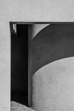
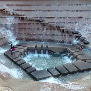
D810, 85mm 1.8, f/16 at 1/125, ISO 100 ... PP consisted of just applying LR's BW high contrast filter, then lightening the shadows a bit, and +15 on the clarity
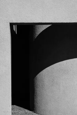
D810, 85mm 1.8, f/16 at 1/125, ISO 100 ... PP consisted of just applying LR's BW high contrast filter, then lightening the shadows a bit, and +15 on the clarity

 .)
.)



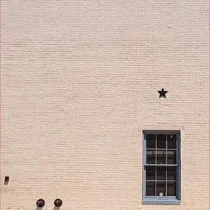
![[No title]](/data/xfmg/thumbnail/35/35263-86f580cf5d28d23109a45984030a79ad.jpg?1734166920)
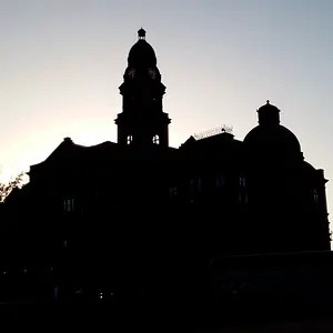
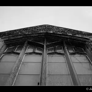

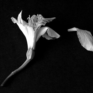
![[No title]](/data/xfmg/thumbnail/32/32706-50b778fbc110c8ea4472547d54c6a923.jpg?1734162290)
![[No title]](/data/xfmg/thumbnail/35/35265-c9ea3efd2c618a57ea136e63ad106880.jpg?1734166927)
![[No title]](/data/xfmg/thumbnail/35/35952-55c8d42ec1c6ff0e13b45356cbf9c068.jpg?1734167758)