Cottage HDR

Parker219

TPF Supporters
Supporting Member
Joined
Aug 27, 2012
Messages
2,289
Reaction score
661
Location
Orlando, FL
Can others edit my Photos
Photos OK to edit
Let me know what you guys think. If you dont want to type out anything long, I am happy with a 1-10 rating, 1 being bad, 10 being great.


1. Regular ---- $Cottage-pm.jpg
 
Last edited:
Without any context, I don't have any appreciation for the significance of the cottage. As stand alone images, there's not much to see here. The first one is better, IMO, but neither of them are particularly compelling. They're technically accurate, well exposed and all that usual stuff, so I'd probably give #1 a 5 or maybe 5.5.
 
^ Thank you sir. Yes as posted 2 is too sharp, on my screen after I sharpened the pic, it wasnt that sharp.

No real context, just think it is a pretty spot and I love how you can see right to the bottom of the water.
 
^ Thank you sir. Yes as posted 2 is too sharp, on my screen after I sharpened the pic, it wasnt that sharp.

No real context, just think it is a pretty spot and I love how you can see right to the bottom of the water.

Aside from your monitor not being calibrated (?), your images are probably suffering from compression.

Web compression is a BOOGER. You can help minimize excessive compression by saving (photoshop) or exporting (LR) by saving the image at a quality level that puts the file size under 500Kb or so. Facebook is the worst at ruining perfectly good images with compression.
 
Where are the 7 dwarfs? I love the HDR on this- The big-time saturation works great. #1 is the best for reasons stated.
 
Thank you, yeah I did another version that was dark and creepy, but you are right, the bright colors fit this image.
 
The second one is over-sharpened IMO. With all those strong, saturated colors it's like an assault on the senses. I prefer the 'regular' one, it has enough sharpness.

Overall, I like the image. The colors are interesting, although rather 'loud'. The gardens give the image a nice sense of depth and the cabin is a good focal point. However, I have a strong urge to crop or recompose the photo, moving the cabin a little to the left, more to a rule of thirds position.
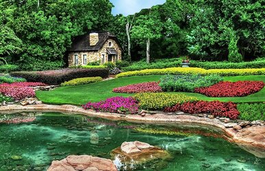
 
I don't really think the *actual* context is needed here, as the viewer kind of imagines their own context--as has been said, it looks like it could be at Disneyland, or one might expect to see the seven dwarves emerging, singing "Hi Ho, Hi Ho..."
Me, I just see a beautiful, secluded cottage and remember how desperately I need to get away from work for awhile. :D

The colors are a little OVERsaturated for my tastes. Perhaps it does work here, but colors that saturated are just generally a bit of a turnoff for me.
If this were mine, besides desaturating a little, I'd crop out the entire flowerbed in the foreground, so that the trailing paved edge on the far side of the water ends just at the bottom right of the photo. As it is, my eye tends to focus more on that meaningless foreground than on the beautiful cottage in the background.
 
The second one is over-sharpened IMO. With all those strong, saturated colors it's like an assault on the senses. I prefer the 'regular' one, it has enough sharpness.

Overall, I like the image. The colors are interesting, although rather 'loud'. The gardens give the image a nice sense of depth and the cabin is a good focal point. However, I have a strong urge to crop or recompose the photo, moving the cabin a little to the left, more to a rule of thirds position.

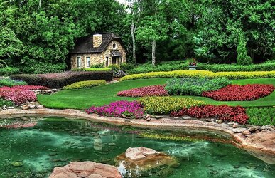
I meant to take out the sharper pic, once I saw how it posted in the thread. I took it out now, it was wayyyy off.

Since someone else mentioned a crop, I think I might post a cropped version....also I will tone it down some. Worth the Edit?

How about one with the sky "fixed" too

$Cottage-pm-cropped-resized3.jpg$Cottage-pm-cropped-resized.jpg
 
Last edited:
I give both a 10 simply because Lecelier is just to the left lol. I like the water it looks cool
 

Most reactions

Back
Top