Thanks for the comments, everyone. Much appreciated!
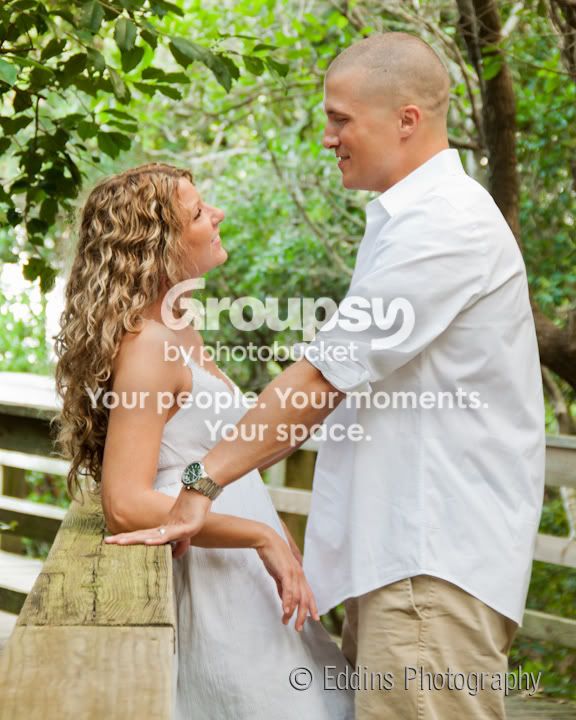
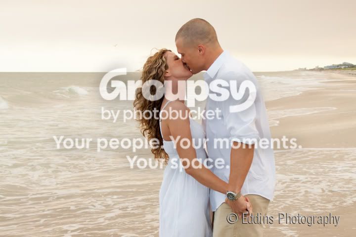
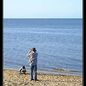
I'm guessing you didn't use reflectors or fill light on any of these? Almost all of them need the subjects faces a little bit lighter. I'd have probably dodged and tinted the water a bit more blue to give some more contrast, as all of the ones in front of the water have very little tonal contrast. THe white shirt, khakis, light brown beach, light brown water all sort of blend together. Even the sky seems to have a sort of grey brown tint. Together, this makes for flat pictures. See how the high tonal contrast in 8 makes them jump out more? Try to get that effect a bit more with the rest of your shots.
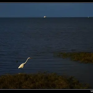
I would have cloned the bird in 5 out, especially since her eyeline points directly at it, making it far more 'important' compositionally in the picture than it should be.
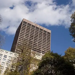
I think 7 & 8 are your best, thoguh I wish the foliage in the background of 8 was a bit more appealing.
Thanks for the critique! You are correct - there were no reflectors or fill flash used here to help everything pop. I recently (after this shoot, of course!) got a flash and have an 8x11 or so softbox attachment. I'd like to play around with that and see the difference. The grey brown color to the sky and overall shot was from a forest fire nearby, so the sky was really smoky. Helped as far as having diffused light, but not so much in having lots of contrast naturally.
I was arguing with myself about the bird in number 5! On one hand, I like the added element. One the other...I agree that it's distracting and takes the eye away from the couple.










![[No title]](/data/xfmg/thumbnail/35/35952-55c8d42ec1c6ff0e13b45356cbf9c068.jpg?1734167758)
![[No title]](/data/xfmg/thumbnail/36/36670-546c6128f51bbe69923c2eb6fd4fa438.jpg?1734169173)

![[No title]](/data/xfmg/thumbnail/36/36669-32e6602a9741e9fefddbc9dc04bc8e8f.jpg?1734169173)