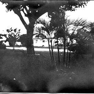
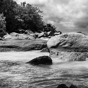
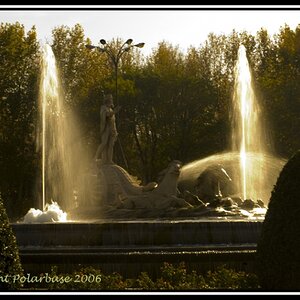
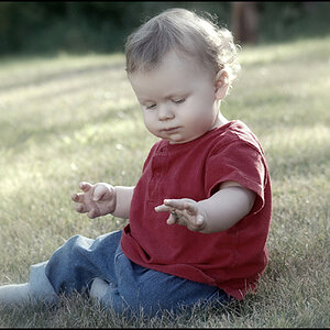
I think this has excellent potential as a B&W (or even a sepia) but it's just a little too mid-tone rich (Grey). Needs a contrast boost and maybe a slight drop in exposure too. The big issue for me however is the composition; the actual subject represents a tiny bit of the bottom, centre of the image. I would suggest re-cropping (or re-shooting if you can) so that the chld takes up much more of the image. I would try and frame it so that the middle of his nose is centred on a point which is 1/3 in from image right, and 2/3 down from the top with some of the door and the walls behind.
Great idea!



![[No title]](/data/xfmg/thumbnail/34/34116-b81991a4a8a532509a981cadbacd573c.jpg?1734164576)