petrochemist
TPF junkie!
- Joined
- Mar 9, 2014
- Messages
- 2,089
- Reaction score
- 1,152
- Location
- North Essex UK
- Can others edit my Photos
- Photos OK to edit
There isn't really a 'Correct color' from the way our visual system works & varies.
Firstly there is the issue of metamers, where combinations of pure wavelengths are indistinguishable from another pure wavelength.
Then research has shown young people typically see more into the ultra violet than older people (I got a distinct blue shift in vision when my cataracts where removed - presumably this was down to correcting much of the UV change.) This is without people with colour blindness.
Careful adjustment of the RGB channels will usually come close to the average persons perception of colour, where this is required. Even then it is possible to get variations if the lighting causes fluorescence or has missing wavelengths different to that with sunlight or other broad spectrum sources. For product photography great care is needed to get the closest match to what the average person will see.
To guarantee a true colour match you need a spectrometer!
For artistic images I definitely stray to creative colour, often using NIR in the mix & sometimes throwing in a ~180º variation in hue - with a 590nm filter this typically looks more natural than a SOOC image!")
590nm SSOC:
 P1160569 by Mike Kanssen, on Flickr
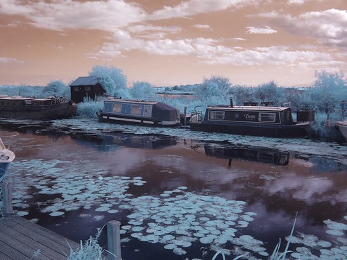
590nm hue adjusted:
 P1160563c by Mike Kanssen, on Flickr
Firstly there is the issue of metamers, where combinations of pure wavelengths are indistinguishable from another pure wavelength.
Then research has shown young people typically see more into the ultra violet than older people (I got a distinct blue shift in vision when my cataracts where removed - presumably this was down to correcting much of the UV change.) This is without people with colour blindness.
Careful adjustment of the RGB channels will usually come close to the average persons perception of colour, where this is required. Even then it is possible to get variations if the lighting causes fluorescence or has missing wavelengths different to that with sunlight or other broad spectrum sources. For product photography great care is needed to get the closest match to what the average person will see.
To guarantee a true colour match you need a spectrometer!
For artistic images I definitely stray to creative colour, often using NIR in the mix & sometimes throwing in a ~180º variation in hue - with a 590nm filter this typically looks more natural than a SOOC image!
590nm SSOC:
P1160569 by Mike Kanssen, on Flickr590nm hue adjusted:
P1160563c by Mike Kanssen, on Flickr


