What's new

Critique please

delpi

TPF Noob!
Joined
Mar 19, 2016
Messages
10
Reaction score
4
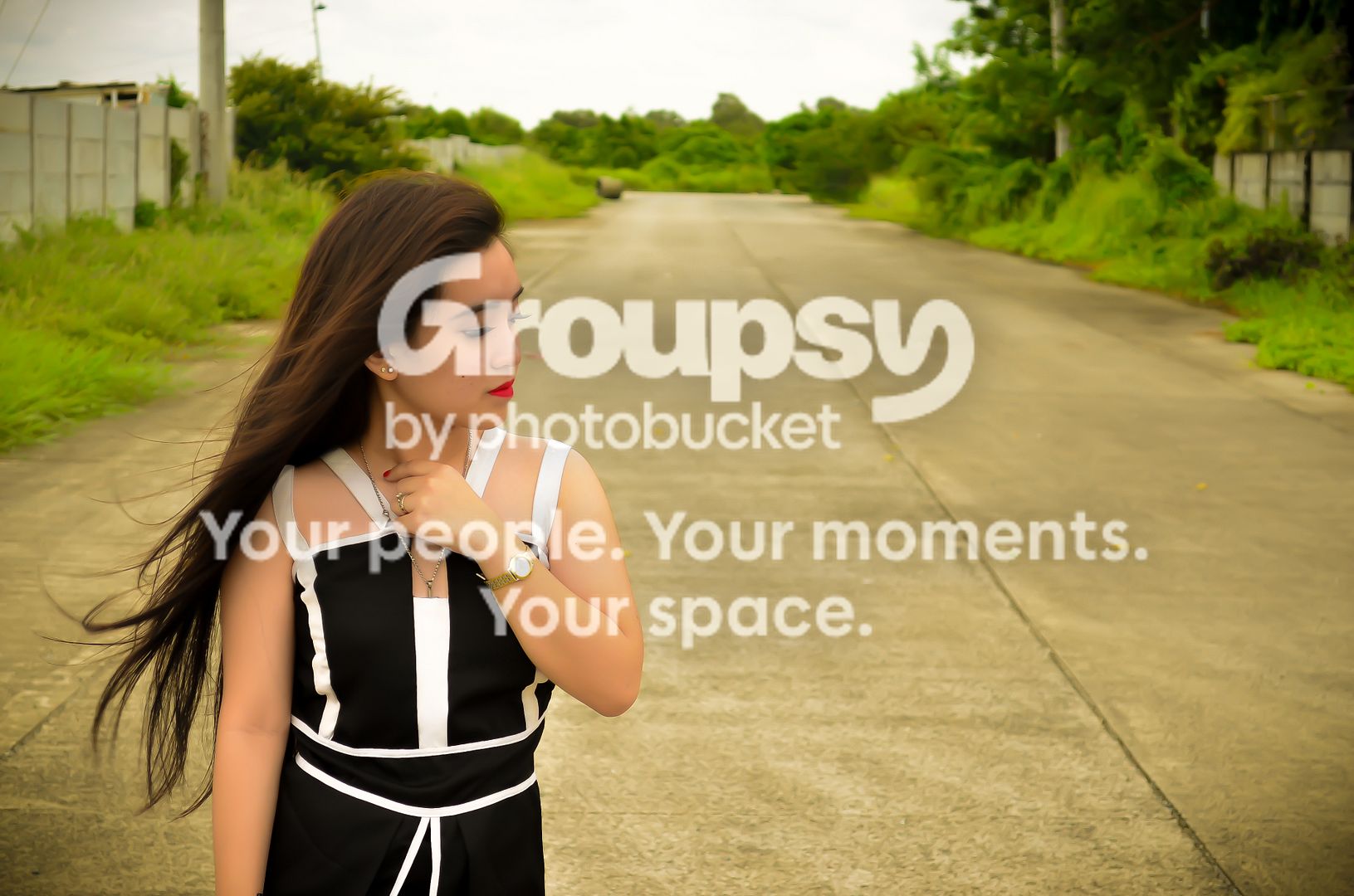
edited5_zpsgdn77mb4.jpg


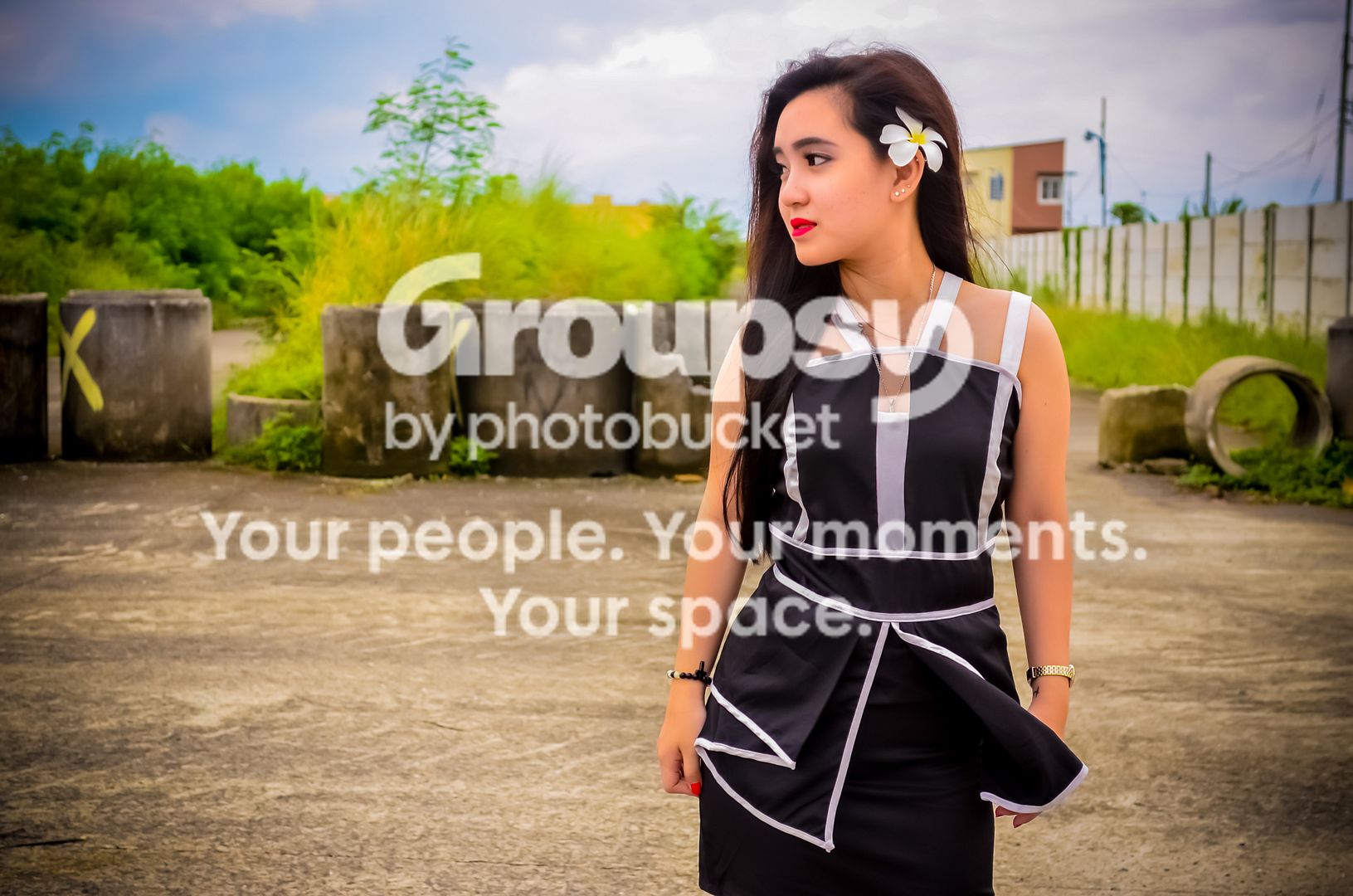
edited2_zpsazj37dav.jpg


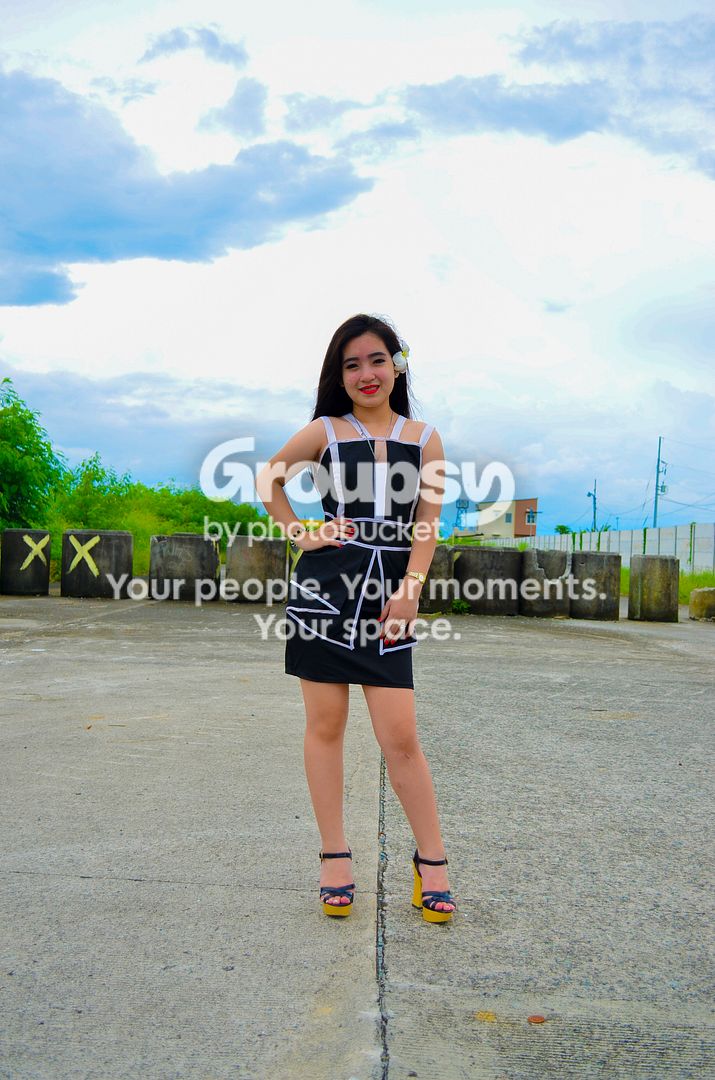
Edited_zpspfqelfpi.jpg


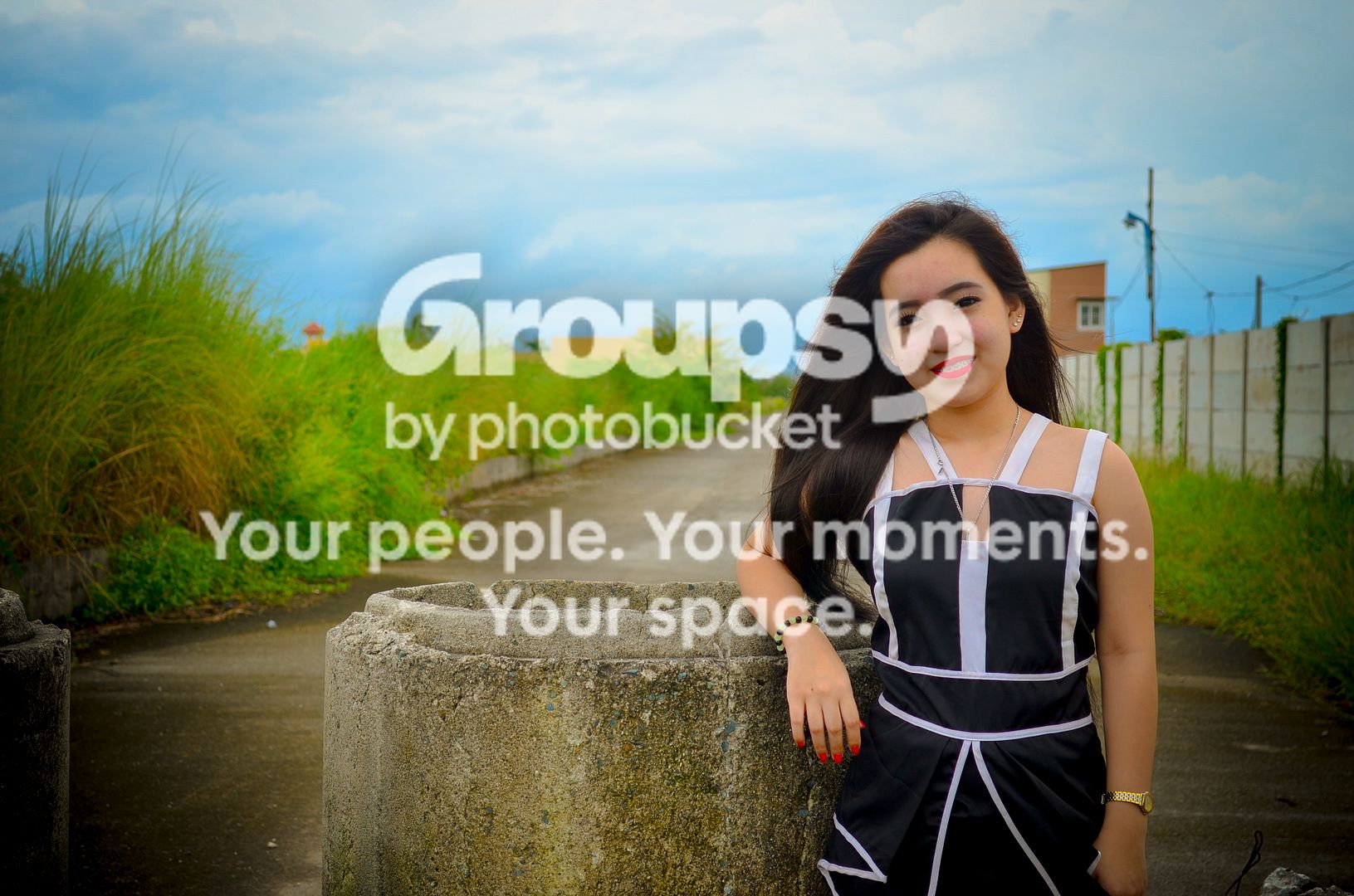
edited4_zpse2oj73vm.jpg


edited3_zpsypxxse8n.jpg
 
1 and 2 for me look much better than the rest.

A hair light ( reflector) and some more editing for #1 could be a good photo. Clone out the top left clutter, clean up the right as well and get that hay bale a bit closer for interest. The lines of the road lead you to the bale so keep that.

Did you paint in all that blue in the last 4 photos? Shoot down on the model a bit if the sky isn't so nice and for a different perspective.

Im a noob so take all that with large grains of salt.
 
Watch the lines and the background.
 
lot of extra space on these. while im not against horizontal portraits, i feel they only really work when theres a reason for including the space on the sides. these dont have anything in the background that I would consider landscape worthy, even though the subject is looking off in that direction.
#3 is shot portrait orientation, but i would still crop a lot of that extra space out.
your white balance seems inconsistent in this set. 1 and 2 are fairly warm, and the pictures get cooler as the set goes on.
consistency, especially in sets, is important.
#5 i would toss. not an interesting enough background to be set that far back, power lines are distracting, as is the housing in the background. this would have made a much better, and closer, portrait orientation shot.

I like the color and the posing on these, so a quick WB fix and some cropping would make 1-4 keepers, in my opinion.

 
You need to get a lot closer. The subject should mostly fill the frame. And portrait format is called that for a reason. People are essentially vertical and so should your frame be.

Keep well away from the saturation slider - real grass does not glow.
 
Watch the white balance, saturation, light direction and light quality too.
Hard overcast delivers a high light source direction and not very flattering quality if both the subject and background have the same hard overcast light.

Some on or off camera flash on the subject would have made her 'pop' (better separation from the background, light wise) and would have been effective a fill for the shots where her eye sockets are dark (raccoon eyes).
 
Hahaha! Thank you all for your insights! I picked up a lot!
 
horrible background compositions....over-weighs all other things in my opinion.
 
I must agree with Didereaux. You need to pay as much attention to the backgrounds as to the pretty model. It looks like you picked the location because it would be quiet and you wouldn't be disturbed. My guess is that it's quiet and deserted because no-one wants to go there!
Even there you could solve most of the background problems by shooting so your model fills the frame and using depth of field to blur the background... or being more selective about where she's standing.

Try again, take all the advice above into consideration and let us see what you've learned. Good luck! :)
 

Create an account or login to comment

You must be a member in order to leave a comment

Create account

Create an account on our community. It's easy!

Log in

Already have an account? Log in here.

Back
Top Bottom