Critique Requested

tnjoann

TPF Noob!
Joined
Mar 16, 2013
Messages
18
Reaction score
2
Can others edit my Photos
Photos OK to edit
Hello!

I am new to your forum. I love photography and I am trying to focus on improving my people photography. I am requesting critique.

I am wanting to improve in the area of posing, I want to learn to shoot people regardless of their body shape in the most flattering way possible, I want to improve at looking around where ever I may be and finding an acceptable spot to shoot in. Of course I also want to be as accurate as I can in camera with exposure, focus, & composition.

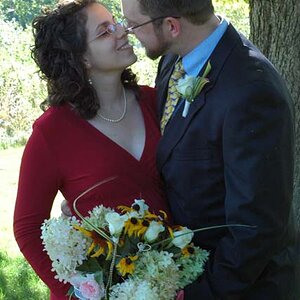
These images were shot with Canon 50d, The head shots with Canon 85 1.8, the other shot with Canon 24-70. Minimal editing (WB adjustment,exposure tweak in raw, usm, resize for posting in ps)

Settings for #1 f 3.2, 1/320, iso 200, fl 70mm, manual mode, available light, auto focus on nearest eye (the whtie spot is snow)
Settings for #2 f3.2, 1/160, iso 200 fl 85mm, manual mode, available light, auto focus on nearest eye
Settings for #3 f3.2, 1/160, iso 200 fl 85mm, manual mode, available light, auto focus on nearest eye

$IMG_3884.jpg$IMG_3919.jpg$IMG_3959.jpg
 
Nice pics. He looks camouflaged with the background. Some fill flash and a faster shutter to dim the background may help contrast and also make him not look so flat
 
The little area of snow kept bugging me when I would look at it, it drew my attention away from his face so I cloned it out.
$IMG_3884 2.jpg
 
Nice pics. He looks camouflaged with the background. Some fill flash and a faster shutter to dim the background may help contrast and also make him not look so flat


Thank You! 2WheelPhoto, for taking time to critique my images. I will try the flash and faster shutter later today if he will pose for me again. Do you mean my light looks flat? I did use a reflector in some later shots than the 3 I posted here. I will add one of the reflector shots to this post and see if that helps correct the light problem. I do see a difference between #2 with no reflector and #4 with a reflector but not sure if it corrects the "flat" problem you see.

#4
$IMG_3972.jpg
 
Nicely sharp, good color but, as said above, a bit flat.

#1 - Without more in the frame the bulk of his torso really overwhelms the eye, I think a scene with more elements, fence, etc.,- and a less passive pose - would keep that from happening. The material of his jacket have a distracting moire pattern.

#2 - Nice hat, very complimentary shape and color. Flesh roll and collar bunch don't help. He looks tilted back to me.
$IMG_3919lll.jpg

#3 Bad, bad hat. Really pulls my eye and competes with the face.
Face is very flat and almost expressionless. Bad collars.

I hope this guy is a willing friend because he has a nice, honest face and would be great to work with and find the right key to his picture. My guess would be a little higher camera position, less turn of the head and a little more expression would make great vital picture.
 
Nicely sharp, good color but, as said above, a bit flat.

#1 - Without more in the frame the bulk of his torso really overwhelms the eye, I think a scene with more elements, fence, etc.,- and a less passive pose - would keep that from happening. The material of his jacket have a distracting moire pattern.

#2 - Nice hat, very complimentary shape and color. Flesh roll and collar bunch don't help. He looks tilted back to me.
View attachment 40179

#3 Bad, bad hat. Really pulls my eye and competes with the face.
Face is very flat and almost expressionless. Bad collars.

I hope this guy is a willing friend because he has a nice, honest face and would be great to work with and find the right key to his picture. My guess would be a little higher camera position, less turn of the head and a little more expression would make great vital picture.

Thank You Traveler! I greatly appreciate your critique!
 
Ok, I reshot today trying to incorporate the suggested changes from traveler and 2wheelphoto. However the light was totally different today as I had sun today and heavy overcast yesterday.

#5 I reshot using flash and higher SS.
Settings f 3.5, 1/250, iso 100, FL 70mm

$IMG_4025.jpg


#6 I reshot using a higher camera angle and less turn of the head. I shot this one inside using light from the window and a reflector.

$IMG_4039 2.jpg
 
IMO, both of these are immeasurably better.
Look at the pictures; as good as they are, how do you think they could be improved upon?
 
I am not too keen on the shooting down on the subject.

Try shooting at eye level or slightly below (to make them look taller/bigger than life).
 
I agree, I'm not really keen on the MySpace angle either.

In pic #5, the background looks brighter than the subject's face.

The indoor shot by the window is the best, IMO.
 
The subject separation is good with the shallow dof, but the lighting is pretty flat. The window lighting looks good, however you never want to shoot a male from that angle looking down. From a theoretical and practical perspective, a downward looking angle makes your subject seem more vulnerable and in a position of weakness. You don't want to give that impression when doing portraits for a male (usually).
 
IMO, both of these are immeasurably better.
Look at the pictures; as good as they are, how do you think they could be improved upon?

Thank You Lew. To answer your question how could they be improved...

Probably on #5 I could push the exposure a little more on the subject. The sun is hitting the grass behind him even though he is in the shade, so background is too bright. I tried to go back to the same spot and reshoot correcting problems from the day before but the light was different, because the weather was different.

#6 I think the light is too bright on subject left, I could position farther from the lightsource (window) to even the lighting out a little. I might be able to shoot farther away and zoom to avoid it looking like he is looking up so far.
 
I am not too keen on the shooting down on the subject.

Try shooting at eye level or slightly below (to make them look taller/bigger than life).

Thank You Dennis for taking time to critique my images! I appreciate it. I was working specifically with shooting at a higher camera level to slim the face and neck area as suggested in post #6 . I hear so many people say they don't want to be in portraits until they loose some weight and I was working with that in mind. I don't want to make males appear vulernable/weak though.
 
I agree, I'm not really keen on the MySpace angle either.

In pic #5, the background looks brighter than the subject's face.

The indoor shot by the window is the best, IMO.

Thank You Cynicaster for the critique! I wasn't familiar with the term "Myspace Angle" but thanks to your mention of it and google I am not familiar with it :) Yes the background is too bright in #5.
 
The subject separation is good with the shallow dof, but the lighting is pretty flat. The window lighting looks good, however you never want to shoot a male from that angle looking down. From a theoretical and practical perspective, a downward looking angle makes your subject seem more vulnerable and in a position of weakness. You don't want to give that impression when doing portraits for a male (usually).

Thank You tacosanchez for your critique! No, I certainly don't want to make him look vulerable or weak. I was trying to shoot from a higher camera angle to make the face and neck look slimmer. Maybe I am shooting too close? Maybe I should be farther away and zoom? Do you have examples of shooting males making their faces/necks look slimmer without making them look vulnerable or weak?

Opps! I think I may know why the light is flat... he is in the shade facing the shade and I should probably have positioned him so he is facing the sunny spots on the grass instead of having it to his back.

Thank You to all who have critiqued and shared your thoughts. If any of you have examples how you have over come these challenges please post them!
 

Most reactions

Back
Top