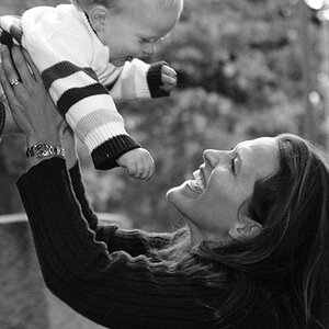
Well it's a little hard to give specific critique when there is more than one picture to critique. However, in general... I think that the pictures are all over-exposed and/or have the contrast set too high that makes a lot of the pictures highlights blown (too white). Also most of them have more than one object in the picture that is in focus (too busy) leaving the viewer's eye a question of "what am I supposed to be focusing on/looking at?"
Oh my I got excited at the title of this thread but I to agree with the other posts , the worst thing I noticed was they're all blurry (not a good blur).
Were you trying for a certain effect?
the contrast was too high it was making my eyes hurt to lok t the screen
in the post above mine i will say #3 is much better then it was before. i find the content in the other ones too cluttered so (for me) it des nothing compositionally. and number 3 kind of bugs me tht the picture is crooked


![[No title]](/data/xfmg/thumbnail/37/37280-a7e70a01ccd331918e71645cd4c1f16e.jpg?1619737977)


![[No title]](/data/xfmg/thumbnail/41/41780-5efe87aed04575de7c09b065d70763ae.jpg?1619739890)