Ok, I'll go one by one.
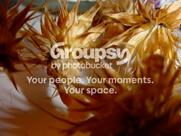
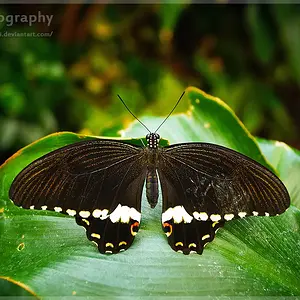
1: I enjoy the texture and the colour in this one. I especially like the complementary contrast between the orangey colour of the main subject and the purple up in the top right; I kind of wish there was more of that purple, but sometimes that just isn't possible.
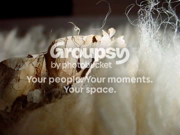
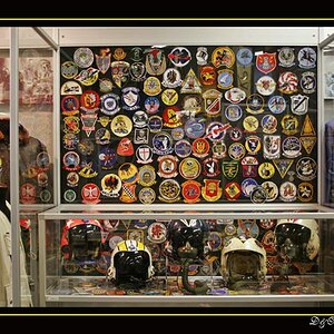
2: For some reason this picture creeps me out a little (not a bad thing by any means), and again, you have done a great job of capturing texture.
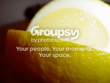
3: I don't think you hit the mark as closely on this one. I'm not totally sure where the focal point is here. Maybe between the front skin and the inside of the fruit? I'm beginning to see that you're a fan of catching the look of surfaces and their small structure, right?
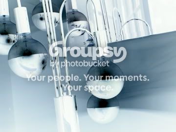
4: I'm not sure exactly what you're gunning for here. The image feels a little lost in the processing.
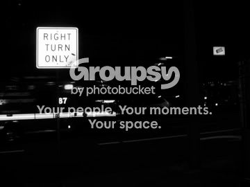
5: I like this, but I'd like to see some more detail behind the sign. There's a lot going on there, but really had to work to find it. Maybe just a larger image size would do it.
6: Again, I like this one too. I have a bit of a thing for pictures of signs and sometimes get funny looks from my friends and family for taking those kinds of shots, but I do it anyway.
Overall, I think the one thing I'd like is to see these pictures bigger. I'm finding myself really having to lean in on my monitor to get anything out of these. I hope this isn't too much at once. I just started typing and found myself here. Anyway, I look forward to seeing more!



 .
. 



![[No title]](/data/xfmg/thumbnail/35/35665-6506470fd930bd101375a007d572615a.jpg?1734167295)
![[No title]](/data/xfmg/thumbnail/35/35669-485de67e98a042d63d728593720828a0.jpg?1734167302)
![[No title]](/data/xfmg/thumbnail/39/39186-88f5235eacfd57deab14674ccf8e7f0a.jpg?1734173061)