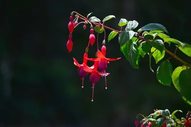
I really liked this picture, the one with the large empty space to the left of the Fucias. I cropped it as shown in the other picture but it seems to have lost something. Is it acceptable to have that much open space or should I go with the cropped version? This may seem simple minded but I have fretted over it for a few days and would value an opinion or another variation.
Take my suggestion with a grain of salt.. I liked the dead space too but, the bunch in the bottom seemed off to me... here's what I would do (similar to your second one but with more branch):