Navigation
Install the app
How to install the app on iOS
Follow along with the video below to see how to install our site as a web app on your home screen.

Note: This feature currently requires accessing the site using the built-in Safari browser.
More options
You are using an out of date browser. It may not display this or other websites correctly.
You should upgrade or use an alternative browser.
You should upgrade or use an alternative browser.
Damn Your Eyes.
- Thread starter Bitter Jeweler
- Start date
keith foster
TPF Noob!
- Joined
- Nov 16, 2009
- Messages
- 506
- Reaction score
- 10
- Location
- Missouri, USA
- Website
- www.keithdewey3.smugmug.com
- Can others edit my Photos
- Photos OK to edit
I think it is good work. I like the de-sat version best. It looks like a cross between a drawing and a photo in version 1. Good art!
Version 2 the effect isn't the same and it looks more like a photo with editing. IMO
Version 2 the effect isn't the same and it looks more like a photo with editing. IMO
OP
OP
Bitter Jeweler
Been spending a lot of time on here!
- Joined
- Apr 27, 2009
- Messages
- 12,983
- Reaction score
- 4,993
- Location
- Cleveland, Ohio
- Can others edit my Photos
- Photos OK to edit
:thumbup: Your opinion is noted, and apprecited.
HannahRebekah
TPF Noob!
- Joined
- Oct 19, 2009
- Messages
- 366
- Reaction score
- 3
- Location
- Michigan
- Can others edit my Photos
- Photos NOT OK to edit
I like it; it's different. Not something I would have normally tried, but I think it definitely words with this one.
Layspeed
TPF Noob!
- Joined
- Oct 11, 2009
- Messages
- 307
- Reaction score
- 0
- Can others edit my Photos
- Photos OK to edit
Very artisitic BT. I like the first one slightly more. From a distance, both look like great photos. Up close, I'm intrigued by the details like you. I like how the editing effect mimics the wrinkles. I don't like the right side by her hair on #2. I don't know, but something about the upper part of her hair looks off to me...but maybe that's just how her hair is. Sorry  But #2 does portray a bit more emotion with color.
But #2 does portray a bit more emotion with color.C-Towner
TPF Noob!
- Joined
- Jan 29, 2010
- Messages
- 64
- Reaction score
- 0
- Location
- Lakewood, Ohio
- Website
- www.flickr.com
- Can others edit my Photos
- Photos OK to edit
I like the effect on both of them, as it's not just a simple texture, and adds a lot of interest to the portrait. I think the fact that it is more of an interpretation of a photo than just a normal photo, it stands well as a cool piece if art that changes based on how closely you look at it.
Hybrid Designz
TPF Noob!
- Joined
- Dec 25, 2009
- Messages
- 211
- Reaction score
- 0
- Location
- Tulsa, Oklahoma
- Can others edit my Photos
- Photos NOT OK to edit
actually i like the first one better. For me i get a sick person looking for comfort or something to that affect. nice process i think.
shmne
No longer a newbie, moving up!
- Joined
- Jun 3, 2009
- Messages
- 641
- Reaction score
- 83
- Location
- Florida
- Can others edit my Photos
- Photos OK to edit
I hope you didn't take it as me calling you out! I just meant that normally when someone would present something like this (were the effect drives the image) people tend to see the effect over everything, which in this case while it is an interesting texture it just seems to be plopped on top. Kind of like a painter not mixing their own paints, instead just buying the colors they want.
Just remember I come from a graphic artist background so images like this are a dime a dozen, so I may be a lot harsher on it than others here! I really like the direction you took with the second one even more, the saturation is a bit high on it though I can see you really softened the highlights and worked the effect even more!
Excellent work so far, I'd like to see you continue this in another photo as well. It could be used as a unique unifying element throughout a series quite easily.
c.cloudwalker
TPF Noob!
- Joined
- Jun 15, 2009
- Messages
- 5,394
- Reaction score
- 405
- Location
- An American in Europe
- Can others edit my Photos
- Photos NOT OK to edit
It could be used as a unique unifying element throughout a series quite easily.
My thought exactly. I've been thinking about turning one of my stories into a comic book using this type of over-the-edge effect but keeping parts of the images as photo looking as possible. If I ever find the time, that is.
Make sure and write down all of the steps you take so that once you find one you really like you can recreate it.
I like both results. They are quite different but both interesting.
shmne
No longer a newbie, moving up!
- Joined
- Jun 3, 2009
- Messages
- 641
- Reaction score
- 83
- Location
- Florida
- Can others edit my Photos
- Photos OK to edit
Make sure and write down all of the steps you take so that once you find one you really like you can recreate it.
To go on this more, it wouldn't hurt to create an action in Photoshop so that you can be guaranteed to reproduce the exact same effect ad nauseam
I
Iron Flatline
Guest
I like 'em.
OP
OP
Bitter Jeweler
Been spending a lot of time on here!
- Joined
- Apr 27, 2009
- Messages
- 12,983
- Reaction score
- 4,993
- Location
- Cleveland, Ohio
- Can others edit my Photos
- Photos OK to edit
I totally appreciated the input! Outside influence is always appreciated. You gave me another "tool" to use. :thumbup:I hope you didn't take it as me calling you out! I just meant that normally when someone would present something like this (were the effect drives the image) people tend to see the effect over everything, which in this case while it is an interesting texture it just seems to be plopped on top. Kind of like a painter not mixing their own paints, instead just buying the colors they want.
I came from a fine arts/crafts background. So my 2D vocabulary is still developing. If you think you are harsh, you need to work on it more.Just remember I come from a graphic artist background so images like this are a dime a dozen, so I may be a lot harsher on it than others here! I really like the direction you took with the second one even more, the saturation is a bit high on it though I can see you really softened the highlights and worked the effect even more!

I too feel I need to drop the saturation a little more.
I need some more people pics to experiment with. I haven't done a lot of "portraiture". I am trying to go that direction though. Again, thanks for your input here. :thumbup:Excellent work so far, I'd like to see you continue this in another photo as well. It could be used as a unique unifying element throughout a series quite easily.
Make sure and write down all of the steps you take so that once you find one you really like you can recreate it.
Mostly I was just tinkering to see what my new toys could do. In further experimenting, that particular effect changes a lot depending on various things with the original, noise, contrast, brightness, smoothness...I kinda like that though. It's more work than "woohoo! vignette!" and the results are varied.
See above. Would you always want it to be exactly the same though? I mean, across a series, would it just become like you said, same effect plunked on an image?To go on this more, it wouldn't hurt to create an action in Photoshop so that you can be guaranteed to reproduce the exact same effect ad nauseam
Honestly, I am surprised as many people liked it (them) as they did.
Cool!
fast eddie
TPF Noob!
- Joined
- Jan 6, 2010
- Messages
- 99
- Reaction score
- 1
- Location
- Seattle
- Can others edit my Photos
- Photos OK to edit
Great exploration! Cool that you're striving to enhance your skill set, and add another "tool to the bag".
I'm pretty much a noob here and to photography in general, but as a graphic designer by trade i feel ok to critique on this one.
I'd stay away from "global" filters. it's usually obvious a filter has been applied (the same as when many on here can tell a saturation change has been made to an entire image rather than spot edits in an image editing program). Rather, use them sparingly to increase attention to the crux of an image.
I think the original photograph was probably pretty amazing, and a subtle texture or treatment to specific areas (without taking away from the photography) could really enhance and have added value. I also think the idea of a series is a good one. the textures would not need to be the same to carry the theme (in fact better if they were different), but each one could represent the mood or feeling expressed in the image.
All that to say: cool concept, I'd love to see what you do with this.
Peace
fast eddie
DScience
No longer a newbie, moving up!
- Joined
- Apr 12, 2009
- Messages
- 1,513
- Reaction score
- 122
- Location
- Denver, CO
- Can others edit my Photos
- Photos NOT OK to edit
Did i just eat an eighth of mushrooms?
OP
OP
Bitter Jeweler
Been spending a lot of time on here!
- Joined
- Apr 27, 2009
- Messages
- 12,983
- Reaction score
- 4,993
- Location
- Cleveland, Ohio
- Can others edit my Photos
- Photos OK to edit
I really like this one. I need to try again to get the closer thumb in focus/less noise. I had a hard time using my flash, focusing, and puting my hands in front of the camera. :er:
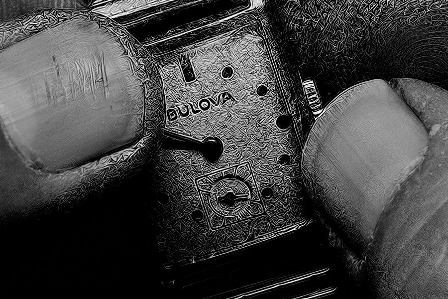
I am not real happy about the shot below. I had a hard time figuring where I should remove texture, and where I should leave it. I like it, but not 100%.
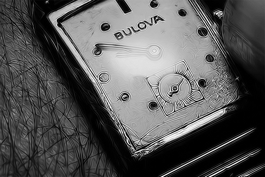
I like this one. I removed texture on the face of the watch, but only partially.
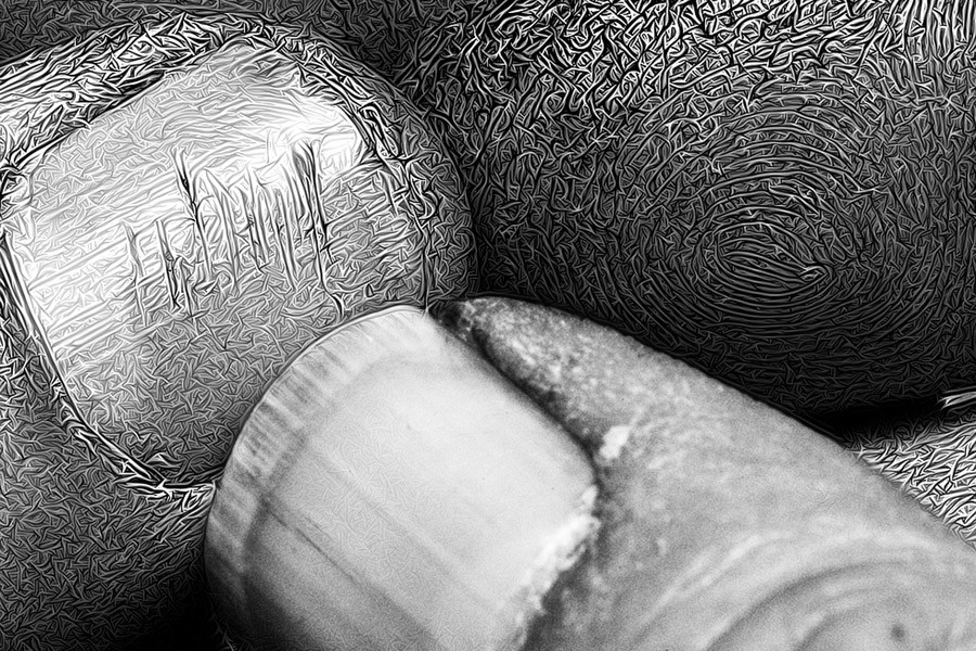
I am digging this one, except for the hard white line on the edge of my thumbnail.

Last edited:
Most reactions
-
 425
425 -
 322
322 -
 291
291 -
 280
280 -
 274
274 -
 231
231 -
 197
197 -
 178
178 -
 172
172 -
 163
163 -
 143
143 -
 143
143 -
 135
135 -
 126
126 -
 101
101
Similar threads
- Locked
- Sticky
- Replies
- 26
- Views
- 2K
- Replies
- 4
- Views
- 388

![[No title]](/data/xfmg/thumbnail/31/31092-7ba73f844ad8efedd3d5fd94799a866d.jpg?1619734609)


![[No title]](/data/xfmg/thumbnail/31/31095-2b52a6dcc956382cffdd384ae4d156f2.jpg?1619734612)