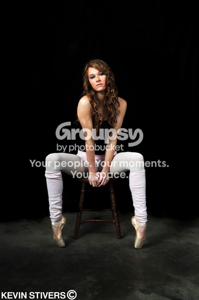
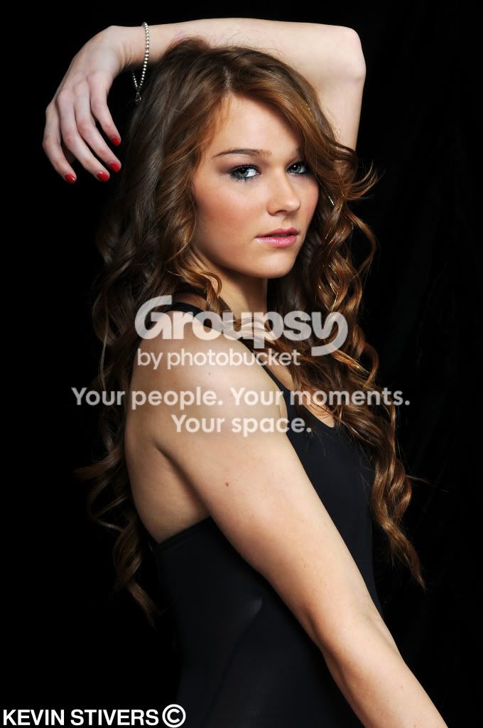
I like the lighting - it looks nicely even, if perhaps a touch bright (see her left thigh in #1, for example). I also like the curve of the backdrop meeting with the concrete floor in #1, it makes the image more interesting than a straight line interface.
The three big cons I see are:
-I would suggest having a bit more separation between the model and the backdrop, so that you can put the backdrop more out of focus (and maybe keep some of the light from falling on it). This would hide some of the texture (wrinkles), which I don't feel add anything to these images.
-The model's black top against the black backdrop is unfortunate. Particularly in the first shot it makes her upper body look disconnected from her lower body. If you must work with these colors, rim lighting would have helped.
-The biggie, and the first question that came to mind - is she really a dancer? Nothing in either shot tells me she really is. Though she's en pointe in the first one, she's doing it seated. I can get en pointe with my rear on a stool. Not meant to be a dig against her, but if she really is a dancer, take advantage of her control of her body to get her in some interesting action shots.