I'm not a portrait photographer, nor do I play one on tv, but here is my take...
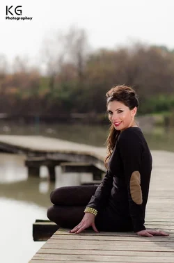
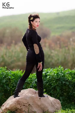
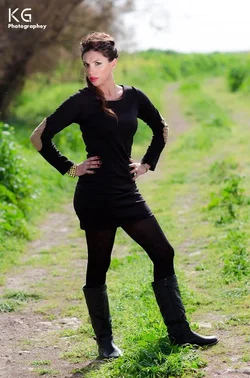
1. Black. Having her (or allowing her to) wear black is probably not an ideal choice. All the detail of her body is lost in the underexposure of her clothes and it's a glaring issue in the shots. You might be able to fix it with curves, but you should try to avoid black and white in clothing for portraits when possible. Also, those clothes are... odd. That's a matter of taste, mind you, but...
2. Her expressions in 2 and 3... not great. 3 is kinda horrible, IMO. She looks like she's waiting for you to throw something at her and is really pissed about it. The pose in both of these shots isn't great either, but seem to fit the face well enough I suppose.
3. The washed out skies are kind of unfortunate, but probably made harder to deal with because of the black outfit.
4. The reflector issue.
The first one seems fine. Best of the set. Nice expression, seems like a nice enough pose. The bridge is a nice leading line. I might crop in a bit to cut out extraneous stuff that isn't lending much to the shot and bring the focus in on her more, but still... seems nice. Maybe a little bit of a color balance issue? Look at her black clothes? They look like they have an odd cast to them.



![[No title]](/data/xfmg/thumbnail/41/41765-153b10bab62ae8adbcc4d984fd08ed74.jpg?1734176069)
![[No title]](/data/xfmg/thumbnail/34/34040-14af4007923299ad46d35fc110d0faad.jpg?1734164446)
![[No title]](/data/xfmg/thumbnail/1/1592-cfae4a7ea791f96c6e2d03484be2e454.jpg?1734142210)