What's new

..:: Darkness ::..

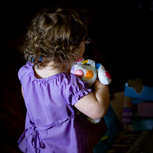
That's something new, right? I will change it of course.

I wish it were new haha. Nope this is fairly old (2005), Thank you for being cooperative not like others who wont change them. Im just trying to get most of the big ones to the regular size.
 
I wish it were new haha. Nope this is fairly old (2005), Thank you for being cooperative not like others who wont change them. Im just trying to get most of the big ones to the regular size.
I don't know why i had the impression that it was 500x100...:) I guess some things can't be explained :lol:
 
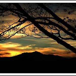
The color one isn't showing up for me... The B&W one looks good though.
 
Thank you third_shift|studios!

did you convert the color to grayscale or just desaturate the color one to get B&W...there are tones that don't appear to be coming across in teh B&W version that i think if it were smoother, maybe it would work just as good.
 
did you convert the color to grayscale or just desaturate the color one to get B&W...there are tones that don't appear to be coming across in teh B&W version that i think if it were smoother, maybe it would work just as good.
I went from color to b/w by desaturation for the second picture. Maybe I should go back and rework the b/w one.
 
oh yes! i realized that once just recently that Desaturating the image drops a lot of values, where as converting to grayscale makes it look much better-please post up the change, bud!
 
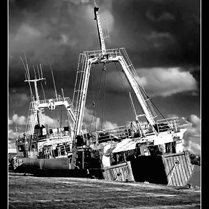
I tried to fix it. Here is the result (I think it looks better now):

darknessbwcu8.jpg
 
Mersad, you really improved the tonal range on this recent version. The highlights aren't blown, and shadow detail at the far right is greater.

On my mac I can open each image in its own tab, and click between them all.

This way the differences can be seen quite easily.

I think the colour version creates more of a mood, but the more recent black + white version is the best image.

Nicely done.

 
Thank you both for your comment. I went back to the original color image and converted it to b/w from there. That's why there is more detail now.
 
I like the new B&W but the color one still is #1 b/c that splash of brilliant orange really catalyzes the subtle dark tones throughout the rest of the image. Well done, man!
 

Create an account or login to comment

You must be a member in order to leave a comment

Create account

Create an account on our community. It's easy!

Log in

Already have an account? Log in here.

Back
Top Bottom