Close, I think a mix of the original you posted and the one shown now would be perfect. Right now it's almost too much, but I still like it better than the original.
**edit** actually if you could post the original again, i want to demonstrate what i was thinking. I use paint shop pro as well as photoshop, and PSP has a gamma correction setting that is far superior to brightness / contrast. It brightens / darkens based on original intensity rather than uniformly. I think you could get the same results using levels, but I'm not that good at that yet.



![[No title]](/data/xfmg/thumbnail/40/40300-583eaa43665714005823e12314084a4d.jpg?1734174710)
![[No title]](/data/xfmg/thumbnail/40/40296-1e3931509698e96fed6a0e43f5cb4adc.jpg?1734174707)
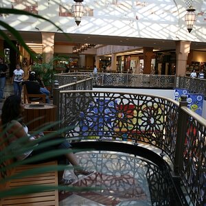
![[No title]](/data/xfmg/thumbnail/42/42280-60cc6d4893a2f440eac7dd2248e733a9.jpg?1734176695)