Desert Dreams: Who would have lived here?

Jasii

No longer a newbie, moving up!
Joined
Jun 17, 2015
Messages
470
Reaction score
171
Location
Dharamsala, Himachal Pradesh, India.
Can others edit my Photos
Photos OK to edit
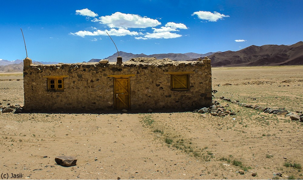
Driving through the arid Desertscape of Ladakh this structure, near Nyoma, standing alone in the middle of nowhere looked interesting and caught my attention. I remember requesting my co-travelers to stop and the darlings that they were they obliged. Many moons later as I dig this pic out from the archives, One look at the clouds and I know what to call this shot. This one is hereby baptized : "Desert Dreams" for reasons obvious. Somebody had thoughtfully stuck some sticks on the roof that kinda looked like antennae and I remembered that the Indian Air force had an airstrip somewhere close.
smiley.gif


I know the shot is too head on, the compo could have been better, yet, I really enjoyed myself as I processed this pic. Do take some time time off to tell me if it strikes a chord or not.

Cheers,
Jasii

Near Nyoma reprocessed again- crop by jasiiboss, on Flickr
 
Last edited:
I must say I like this shot a lot. Maybe it's head on, or for some the composition is off. But I like it.

The colors are great, and it's has a bright feel. However the building is still darker and feels aged. The clouds and sky about e are a great contrast. Points for the awesome score.

Those once in a blue moon shots aren't always great. But you have one right here. A bit jealous.

Sent via Tapatalk. Please excuse any typos.

Thanks for being overly generous and kind, am well n truly humbled. :02.47-tranquillity:
 
I really like it, and the more I look at it the more I like it! :)
 
I really like it, and the more I look at it the more I like it! :)
Thank you my friend. I guess, I should start looking more and more.......... :1219:
Will wait for other Landscape aficionados to pitch in with their thoughts, till then will keep the verdict in abeyance.
Cheers!

Jasii
 
Not bad, lighting is a bit harsh but I like the sky color. Composition is definitely off, the top line of the building is even with the horizon line.
 
The composition isn't really working for me on this one, I feel it needs more sky and I think the scene might have held more impact shot from an angle slightly from the left or right to capture a bit more of the vastness of the desolate landscape, but you already said you knew the comp was off. So, since the landscape isn't really helping a lot and the building is the subject here anyway, perhaps go for a square crop to isolate the building more from the similar color of the land around it. Zoom in on it a bit as well to get a better view of that great stone texture and that old wooden door. Just my opinion. :)
 
Is this something that you can reshoot? The light has ruined what could be a good shot. Taken at either sunrise or sunset depending on where the building faces would be best. And you have too much dirt and not enough sky. Also if you could try a wide shot I think you might like it.
 
Late to the party Jasii, but I agree with everyone above. It does seem worthy of staking out for a better time of day and better composition.
 
First, please forgive the very crude PSing.
The technical elements of sharpness, exposure, wb etc. are all excellent.
Perhaps sharpening only the building a bit to give it more dimension and contrast while preserving its darkness.
I agree with others about discomfort on framing. The building is at one side for no reason and the compostion seems off-balance.
To get a feeling of isolation, which is what the building alone seems to imply, I would have tried to get higher and show the empty space behind.

(Why flip it?
As an English speaker and writer, I am much more comfortable with entering from left to right - and the leading lines here are so strong right-to-left that it is a bit disconcerting.)

desert4444444.jpg
 
A few things come to mind.

The "first reaction" I had when I saw it was that the building face is under-exposed and, of course, exposing for that face would have rendering everything else over-exposed. There's a lot of data in (dark tones are not clipped) in the building -- which means if you boost the "blacks" and use an adjustment brush to "dodge" (increase the exposure selectively only to the airs you select -- typically a "brush on" adjustment) you can recover a lot of the information in the shadows so it isn't quite so dark.

Incidentally, if you should run into a similar situation in the future, bracket the shots. Shoot the exposure you believe to be correct, then shoot an additionally exposure which is intentionally over-exposed by 2 stops and another exposure which is under-exposed by 2 stops (change stops by shutter speed -- not aperture. If you adjust aperture you alter the depth of field and then the images might not merge correctly.)

You can take those 3 bracketed images into Lightroom and do an HDR merge (select the three bracketed images so they are all highlighted, then navigate to "Photo" -> "Photo Merge" -> "HDR" and Lightroom will produce a new (4th) image which takes care of the deep shadows and is easier to adjust.

The second consideration I had was the amount of empty space in front of the building. There is the one lone stone but I don't think it presents a strong enough grounding point. I held a sheet of paper in front of my monitor to block the lower 15% (that's a guess) to see what it would like and I think I like the cropping better.

And then one last consideration... some images look better in black & white. Usually if I feel like the strong point of the image is a sense of structure, texture, pattern, etc. then I consider that they might look better in B&W (not everything does). When you use a tool to do the B&W conversion that offers choices then you can control how the colors convert to B&W. This image would do fairly well if processed with either an "orange" filter or a "yellow" filter. A yellow filter would create a darker sky with stronger punchier clouds.
 
Ok Jasii. Here's another curve ball, we're going back to lines but they're not going to be attached to what you think. ;)

I like the processing, the colours and the contrast suit the scene, harsh mid-day sun in harsh conditions. I like the harsh edges to the shadows and the shadowed side of the building, which you should resist the urge to recover detail from as this will just render it with the same tones as you have in the rest of the image and reduce it's impact as a separate entity within the image. The composition is close in my eyes, but the horizon is off...

It is a little off, and a comment that's heard many a time on this forum, so let's explore a little where it comes from because it's very interesting.

So what is the frame of reference for a straight horizon, what exactly do you compare a squint horizon to to know it's squint? It can't be the image, so let's remove it and have a look.

ex-1.jpg


There you are, just an empty frame and a line, which is squint. You see the straight horizon is completely independent of the image and does in fact exist as an imaginary line within the blank frame. In fact all horizontal and vertical lines already exist within the frame and are completely independent of any image that's put within the four borders of that frame. Thirds and golden ratio are all defined by the four borders of the frame and not the image. The same is also true for diagonals, and especially true for the centre.
So let's look at some diagonals and the triangles that can be formed with them.

ex-2.jpg


ex-3.jpg


See how the angles and intersection points are radically changed with aspect ratio without any image being present.

The compositional lines and balance are functions of the frame in which you choose to enclose your image and do not exist as a function of the image itself. And just as you need to find a suit that fits you, so you need to find a frame with it's implied composition and balance that fits your image. Try it, find an image in complete balance and move a border or two, see how it alone upsets things.

There is another aspect to balance as well. Think of the objects as having a weight, then place these objects on an imaginary set of scales with an imaginary fulcrum point, which (you guessed it) is a function of the four borders of the frame and not the image.

If I do that with your image I come up with this:

mod-1.jpg


Which is close enough for a cigar. :D
 
Last edited:
I like the shot as is but if it was in HDR I think it would take it to the next level.
 
Last edited:
I think the horizon needs to be leveled, and the front of the building needs to be dodged a bit to lighten it up. You've been given excellent advice by TCampbell and Tim Tucker.
 

Most reactions

New Topics

Back
Top