Desolate

Demers18

TPF Noob!
Joined
Nov 11, 2011
Messages
1,330
Reaction score
265
Location
Sudbury
Website
www.flickr.com
Can others edit my Photos
Photos OK to edit
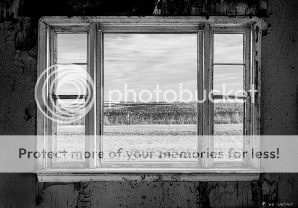
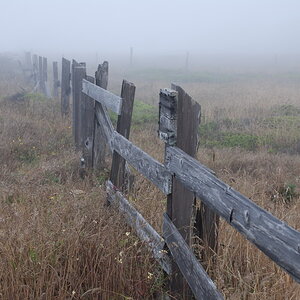
Setting foot into this abandoned home I couldn't help but feel a sense of despair and emptiness.
I feel the title desolate explains this photo in more ways than one.

10916626776_e5d2a0c087_b.jpg
[/URL] Desolate by lee demers, on Flickr[/IMG]
 
I like this; I think a little more contrast might not go amiss, and I might clone out the line of towers; they sort of take away from the desolation to me.
 
I think it would have been better to not explain it. The picture speaks for itself.
 
I like this; I think a little more contrast might not go amiss, and I might clone out the line of towers; they sort of take away from the desolation to me.


Thanks for your comments, although I would have to disagree. I feel the telephone poles actually add to the desolation by providing depth.
 
I like this; I think a little more contrast might not go amiss, and I might clone out the line of towers; they sort of take away from the desolation to me.

Thanks for your comments, although I would have to disagree. I feel the telephone poles actually add to the desolation by providing depth.

I disagree with this. The poles add attachment to the rest of the world.

I'd remove them and make sure you are perfectly horizontal, i feel like the window is skewed in the frame and it's bothering me the most.
 
I think the concept is great and the execution damn near.
What does bother me is the black frame, the light lower left corner and the relative brightness of the wall.
I think that fights the idea.

10916626776_e5d2a0c087_blll.jpg~original
 
I really like this image and would love to shoot something like this someday.
 
I like this; I think a little more contrast might not go amiss, and I might clone out the line of towers; they sort of take away from the desolation to me.

Thanks for your comments, although I would have to disagree. I feel the telephone poles actually add to the desolation by providing depth.

I disagree with this. The poles add attachment to the rest of the world.

I'd remove them and make sure you are perfectly horizontal, i feel like the window is skewed in the frame and it's bothering me the most.

Fair enough, although I still feel the poles add to the image. Isn't personal perception great ;)
your feeling is quite accurate, is the window skewed? Absolutely, the whole house is skewed. You should have seen the deck I had to walk on just to get inside. If i were to "leveL" the window, the horizon would then be skewed and that is what I'm using as a reference point.

I think the concept is great and the execution damn near.
What does bother me is the black frame, the light lower left corner and the relative brightness of the wall.
I think that fights the idea.
I see where you're going with the darker wall. I think it may not be a bad idea to darken it some, maybe not as much your edit though.


Thank you all for your comments.
 
The_Traveler's darkening of the interior wall, and his elimination of that troublesome lower left hand corner's odd brightness have improved the image. I like the poles...they add depth clues, and also show us a landscape that has no trees, no anything...just space...and poles...all that said, on such a formal study as this, I would suggest a very slight counter-clockwise rotation and cropping. I think the window being un-level looks unnatural or careless, or as if the shot were made with the camera not level and not properly squared-up. The horizon is small and hard to read, visually, but the window is looming and large, and it's obviously crooked.
 
The_Traveler's darkening of the interior wall, and his elimination of that troublesome lower left hand corner's odd brightness have improved the image. I like the poles...they add depth clues, and also show us a landscape that has no trees, no anything...just space...and poles...all that said, on such a formal study as this, I would suggest a very slight counter-clockwise rotation and cropping.

Exactly, nice choice of words Derrel.
 
The_Traveler's darkening of the interior wall, and his elimination of that troublesome lower left hand corner's odd brightness have improved the image. I like the poles...they add depth clues, and also show us a landscape that has no trees, no anything...just space...and poles...all that said, on such a formal study as this, I would suggest a very slight counter-clockwise rotation and cropping. I think the window being un-level looks unnatural or careless, or as if the shot were made with the camera not level and not properly squared-up. The horizon is small and hard to read, visually, but the window is looming and large, and it's obviously crooked.

Thanks for the insight Derrel, I'll have to give it a go and see what happens.
 
By the way, I really LIKE your picture! It makes me think of the middle of the USA, out on the plains or something, or perhaps a very lonely, remote part of Texas...some place where there just is nothing around as far as the eye can see, except maybe a two-lane road and some utility poles running along side it...the occasional small flocks of birds that sit on the wires for a bit, then fly off to someplace better, hotness, oppressive hotness, and boredom.
 
Interesting shot, I think too the contrast could be adjusted (I might have adjusted exposure and/or bracketed shots at the time). I think I'd actually like it if the poles showed up a bit more, might draw the viewer's attention to what's off in the distance. I guess it's a matter of if you want to emphasize the inner walls or what's out the window. Cool photo - one maybe that you could even do more than one version of it.
 
I wouldn't change a thing. I agree with some others that the poles actually make it seem more desolate. For this to work, I think the inside has to compete with the outside in brightness, or it becomes more about the view than an inside/outside balance. As for a tilt, I'm not even sure I see it - a lot of lines in this are not true vertical or horizontal, so it's really just your choice.
 

Most reactions

New Topics

Back
Top