Different style (Nsfw)

cauzimme

No longer a newbie, moving up!
Joined
Nov 3, 2009
Messages
469
Reaction score
362
Location
Montreal
Can others edit my Photos
Photos OK to edit
This week I tried different kind of shooting, still for the same purpose but more fun involved (Just because it's new) and lots of colors, which I'm actualy not a big fan.

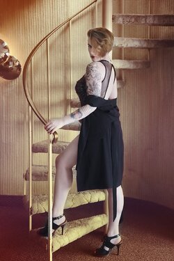
This one was for a tacky 70's porn inspired photoshoot, I gave her one edit that wasnt that much, but she wanted to push it to the extreme with the filters. (Yes there's carpet on the walls)
toomuch.jpg
994209toomuch.jpg


Other...
806147DSC3544copy.jpg


And a soft BDSM shoot:

277436DSC3124copy.jpg
 
Last edited:
where ? I can't see it ? I'm now moving my screen, maybe I watched this image for too long, I don't see anything.
 
Your lighting is so beautiful. I love these. I think that the first one could use just a tiny bit more contrast. Do you use adjustment layers in photoshop when you edit? If you do, I would suggest using a Curves adjustment layer in order to make it slightly more contrasty.
 
Your lighting is so beautiful. I love these. I think that the first one could use just a tiny bit more contrast. Do you use adjustment layers in photoshop when you edit? If you do, I would suggest using a Curves adjustment layer in order to make it slightly more contrasty.

Yes I do, I'll give it a try thanks :)
 
Carpet on the walls??? That is great!!!:1219: My brother and I joked about putting shag carpet on the walls of our VW Bus!:biggrin-93:

These seem like very nice photos to me, great job! :)
 
Overall I like these, but there are some things I think in each one which could be improved. Please take these as constructive criticism, things to keep in mind for future shoots.

1) The Stairway to Heaven
I like the processing here, I think it fits the scene very well. I like the over-the-shoulder glance and the hair covering one eye. Where I would tweak her pose is in the foot up on the stairs. Partly because that foot is resting solidly on the stair - toe and heel - her entire pose seems a bit stiff. If that foot had been up one stair higher, and only contacting the sole of the shoe (heel in the air), the pose would appear more dynamic and put some more definition in her calf. You may also have been able to move that foot slightly so that it wasn't being cut by the railing. I'd also look to remove the mirror (artwork?) from the wall, either by actually taking it down, cloning it out, or reframing the shot. I'm not saying it draws the eye, but once you glance at it there is enough going on that it sucks you in. And where the crop cuts through it makes it seem incidental (which it probably was) - if it doesn't add to the shot, might as well remove it.

2) The Colorful Boudoir Shot
I love the colors in this image. The bra and panties, the shoes, and the pillows work very well with the neutral sofa and wall. Unfortunately I think the pose here is a fail. I don't know if this is the final crop you provided to her or if you cropped to remove her face for posting on here, but as shown here the crop across her face diminishes her as a person. If you're going for an air of mystery, I'd shoot her looking to the side or away from the camera (include what seems to be fabulous hair) rather than capturing her looking back at the camera and then disregarding (cropping) that engagement. Even if the full image includes her face, I think you missed a couple opportunities with her shoes (you're getting more of the dirty bottoms of her soles than the wonderful bright orange) and, frankly, her breasts (by letting her right arm cover her curves).

3) The Soft BDSM Shot
There are only two things that bug me about this shot. I'd suggest, if you revisit this, to remove the sofa. It's presence actually led me to think she was sitting on it at first - it took me a minute to figure out why you even titled this a BDSM image. The sofa is also too convenient a surface for her snack plate, and that ends up being partially blocked rather than coming across as an intentional element. Lose the sofa, bring in a small side table, and I think you have a tighter image. The second thing (also true in the colorful boudoir shot) is that it is annoyingly just a touch off center. You have some elements (the bed, the art on the wall) which would create a nice symmetrical layout if centered. Alternatively you could go more off-axis with these elements. But as is (and maybe it's my own OCD), I get a feeling of "oh, so close!"

There is a lot I like about these images - they look sharp, the lighting looks good, I like the concepts - these are just some nitpicks in the execution which I feel could have made them a touch stronger.
 

Most reactions

Back
Top