I'd say: It depends. I have no idea what "the school's" website looks like, or what kind of criteria they might have for determining whether to use a particular photo on it.
In my area, I've seen some really nice, professional school websites, and I've seen some that look like they were put together by a 13-year-old in 1988 and never updated since.
So there's really no way for me to assess whether your photo is "right" for your school's website.
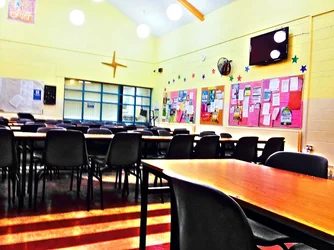
However, if you'd like some general C&C: I'd agree with Justman that it looks a bit "overcooked" on the exposure and saturation.
Beyond that, if you hadn't told me it was the Canteen (they called those school cafeterias when I went to school, back in the dark ages), I'd have no idea what I was looking at. There's too much going on in the photo for me to really pick out what you intend the subject to be. The perspective also seems a little odd; the angle it's shot at, to me, makes it look like all those chairs are about to slide downhill.
What exactly are you wanting to show in this image? The whole of the Canteen? If so, I'd try a higher perspective where perhaps that front table and the floor wouldn't end up being the main focal point.
But--I'm also older than some of the rocks my son collects, so I have absolutely NO idea what make capture the attention of a school kid today. The school might just love this and feature on their home page for all I know!




![[No title]](/data/xfmg/thumbnail/33/33490-cbbf9df0a1c31291ee7a3759afe943cc.jpg?1734163602)

![[No title]](/data/xfmg/thumbnail/39/39498-362f11d9bfd0d9e222faa85b38801745.jpg?1734173616)



![[No title]](/data/xfmg/thumbnail/39/39499-b11b4321c0f029e3a5523ccab621b71c.jpg?1734173619)