What's new

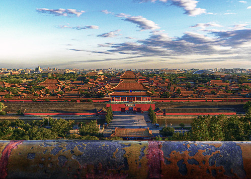
Does this look unreal at all?

echoyjeff222

No longer a newbie, moving up!
Joined
Jun 27, 2010
Messages
645
Reaction score
140
Location
WA
Can others edit my Photos
Photos OK to edit
I posted this awhile back, but it was included with 3-4 other photos so it didn't get much attention.

All I did in this photo was increase brightness in the foreground bar, increase vibrance, and burn/dodge the clouds.
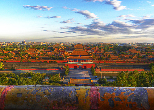

Forbidden by echoyjeff222, on Flickr
 
is the picture visible? :D
 
It's way too saturated/vibrant for my tastes, so yeah, for me at least it looks kinda unreal.
It also gives me a bit of a crick in my neck from the tilt of it--I can't quite figure out which line or lines are causing the tilt effect, and find myself wondering if it really IS tilted, but it really kinda throws me off. Which isn't that hard to do. :D
 
now you're making me think that as well ... i think there is a slight skew between the front line and the back horizon...
 
Pretty darn saturated...I'd ease up on the reds at least
 
yea.. UNREAL!
 
better? just FYI it was GORGEOUS lighting that made the reds on the rooftops really come out.


forbidden2 by echoyjeff222, on Flickr
 
Second one is better, but still too saturated for my tastes. Has a lot of potential though, looks like a great location.
 
That's pretty good. I can't believe that actually looks faded to you. Your mind must be a strange and colorful place.
 
Yeh, to me it looks like a bad HDR shot. Oversaturated. From what you said about the colors coming out, I think I know what the problem is. The reds are hi-lighted without any reference for us to know that they are highlighted. There's not enough sharpness to see textures and be able to distinguish a reflective highlight from the normal color. So it ends up just looking blown out everywhere.
 
The last is best. A shame that you have the big white splotch in the upper left.
 
It definitely looks "juiced"...is it on steroids? lol....

Yes, the white splotch jowensphoto mentioned really is hurting the shot quite a bit.
 
Your photo looks better after the desaturation.

The perspective could be better on this photo. The subject is lost and the pipe going across the front is dominant.
 
Few considerations:

1) try just adjusting the saturation for the reds/yellow colour channels only. That might let you keep the overall tones higher, but without the reds taking things into an otherworldly look.

2) To me the white patch on the left isn't a distraction - its there and white does draw the eye, but I don't know it just seems to be a soft sky white not a glaring white patch.,

3) Is your monitor calibrated using an external calibration device (like a Spyder). If not it could be that your screen is running very dull (not as common as running very "hot" but certainly possible) and thus what you are seeing and what we are seeing could be quite different.
Also if you're using an LCD screen make sure you'll looking as flat onto it as possible - if you're looking with an elevated or lowered angle the contrast and brightness will change. You can get LCD screens that don't have this effect, but they cost a fair bit.
 

Create an account or login to comment

You must be a member in order to leave a comment

Create account

Create an account on our community. It's easy!

Log in

Already have an account? Log in here.

Back
Top Bottom