My type of subject, and this one in particular is killer.
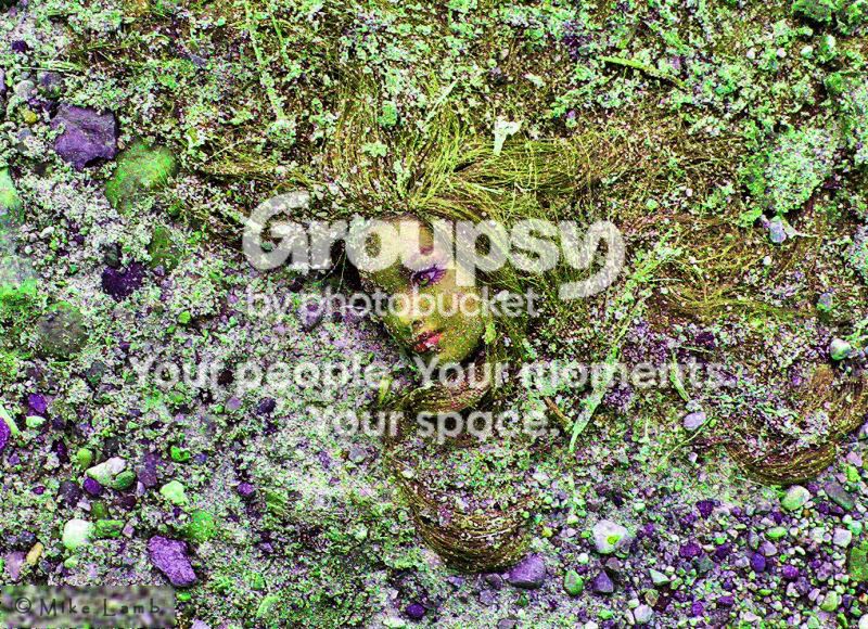
I'm not a fan of this oversaturated crazy-colour processing that you're using on your photos (at least the two I've had the chance to comment on today). That being said, I think that lowering the saturation a bit might make it more palatable to me.
Regarding the composition, I think it works very well as is. The rule of thirds is just a guide, much like the do-not-centre-things bit of wisdom. Composition is about balance (or imbalance, if you're trying to create tension). Here the head is tilted and the flow of the image is dictated by the direction in which the doll's eyes are looking, all of which is counterbalanced by the hair flowing to the top right. The result is great balance, at least in my opinion. I wouldn't change a thing.





![[No title]](/data/xfmg/thumbnail/31/31085-9786bf0c16c072633ecdfad477c23095.jpg?1734159197)