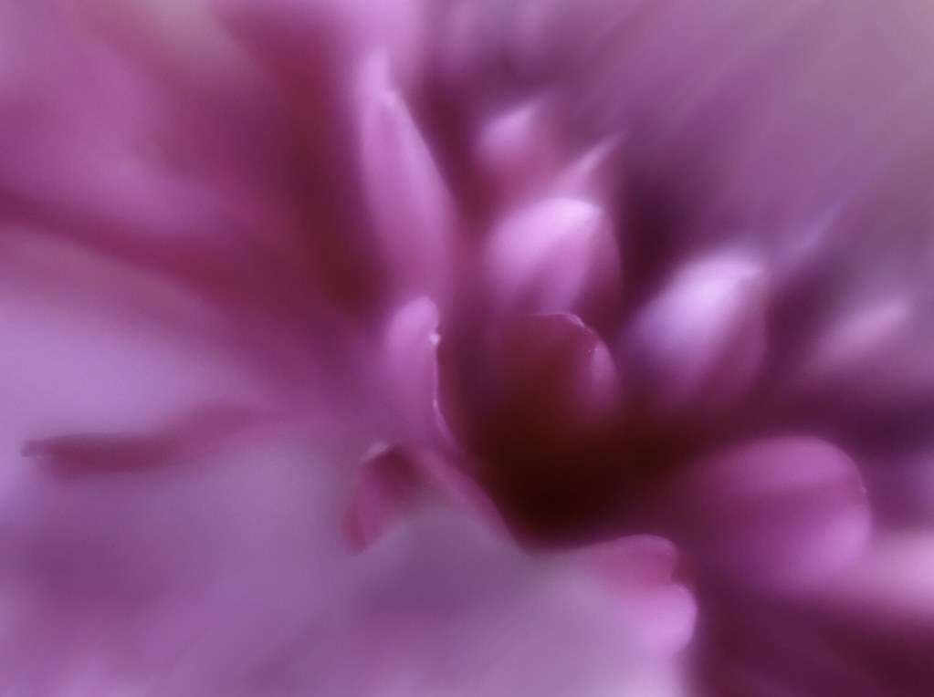
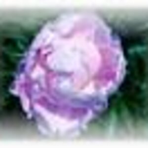
Hmm. Although I generally agree with how Derrel sees things, in this case I have no issue with this composition. I fear if a crop were made as he suggests, then suddenly the inner parts of the flower would be too front & center, with very little space to float it in. Since you took the trouble in editing to make this flower so soft and floating, I think your composition is spot on - the inner parts of the flower need space in which to float.
I also get what's being said about the eye being led out of the frame but, in this instance, the soft, blurred diagonal lines in the right upper quadrant fill the space and it seems fine to have them go out of the frame. They are merely diagonal lines, not the inner part of the flower.
My main nit here is the size of the darkest spot of the frame, just right of and slightly below center. I think if you had taken the camera and rolled it slightly right, to get more of the center part of the flower, it would have reduced the size of that dark spot. That said, you took this shot with "Contrast" as the goal, and this angle
does show the contrast between the lighter and darker values of the picture close together, and very clearly. So, photographer's choice here, IMO.
The colors are beautiful, and I love the overall soft, floating feeling of the shot. This lens looks fun as all git-out.






![[No title]](/data/xfmg/thumbnail/32/32635-be18e952e67667cbb1525b4b057b6423.jpg?1734162121)
![[No title]](/data/xfmg/thumbnail/32/32632-476f3d925401f13cffe1cc2b41945614.jpg?1734162117)