What's new

Durchblick

Much better, than the chairs in the corridor when comes to interesting scene. The upper left corner bugs me, it's distractive, it is like second story in the same picture. I tried to trim it, but then the tree becomes "illogical" :1251:. I don't know. Scene has good potential, it would require a bit more of study I guess...

 
Much better, than the chairs in the corridor when comes to interesting scene. The upper left corner bugs me, it's distractive, it is like second story in the same picture. I tried to trim it, but then the tree becomes "illogical" :1251:. I don't know. Scene has good potential, it would require a bit more of study I guess...

This is a different type of photo from Window Seats, so I suppose the appeal will also differ. I see what you mean with the upper left corner, but for me, rather than being a distraction, it adds another dimension to the photo.
 
I wonder if the post processing needs work, very bright it is with very bright whites. I wonder if for instance less exposure would be better.
 
I wonder if the post processing needs work, very bright it is with very bright whites. I wonder if for instance less exposure would be better.

No, I don't think so and feel it's just about right as is. Thanks for the input, though. I will certainly be returning to this when I have the chance and will bear your thoughts in mind when I do.
 
Last edited:
Much better, than the chairs in the corridor when comes to interesting scene. The upper left corner bugs me, it's distractive, it is like second story in the same picture. I tried to trim it, but then the tree becomes "illogical" :1251:. I don't know. Scene has good potential, it would require a bit more of study I guess...

This is a different type of photo from Window Seats, so I suppose the appeal will also differ. I see what you mean with the upper left corner, but for me, rather than being a distraction, it adds another dimension to the photo.

I went back today and took another few shots with your thoughts concerning the upper-left corner in mind. This is what I came up with:

View attachment 90420

I may play around with it a little more in post but I like the square crop and think it suits the subject.
I like this crop. It sublimates the subject to singular and "clean" level. :bek113: My wording ! LOL. But that's my ideas; if something is not an integral part of the subject, it presents in field of view should be minimalized . Often the beauty is in simplicity.
 
Last edited:
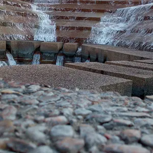
OK, so I've played around a little more with it and have another 3x2 version:

View attachment 90426

I think this works well, despite the blotch or maybe because of it.

I really like this crop better, but I don't care so much for the blotch. Too bad some dingus had to throw a milkshake or whatever at the wall :apologetic:
 
The blotch actually is perfect, delicate and barely visible contradiction to perfectly regular shapes of the structure.
 

Create an account or login to comment

You must be a member in order to leave a comment

Create account

Create an account on our community. It's easy!

Log in

Already have an account? Log in here.

New Topics

Back
Top Bottom